User Research, Research Analysis, Wireframing, Prototyping
September 2023 - June 2024
In the course provided by the UX Design Institute I was tasked with developing a new solution for an Airline Booking Website. This curriculum was broken down into single 'Projects' which were to be submitted for marking.
The goal of this course was to create a high fidelity protoype following the UX Design process outlined in the curriculum. By the end of this I would have the foundational knowledge and skills to apply these principles in real-world scenarios. Even better I would have a project to include in my own Portfolio.
This involved reserching a variety of competitior products to gage an understanding of user flow, mental models and visual hierarchy. In this section I selected products targeting the different price points in the airline industry. By doing so I was able to identify key features and pain points across the market.
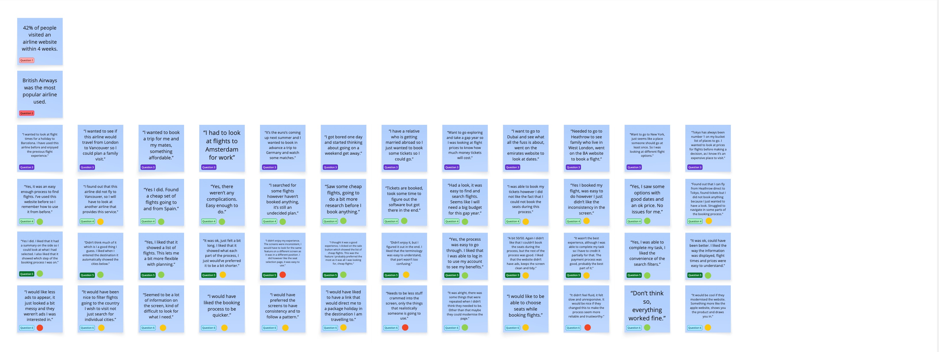
Using Google Forms I created a survey to gather both qualitative and quantitative data from friends and family. By doing so I was able to gain insights outlining past experiences from when visiting airline websites. Having asked open ended questions I had more flexibility in capturing nuanced feedback. Asking questions like 'Why did visit the website that day?' and 'Were you able to complete your tasks that day, if not why?' gave empathetic insights into user needs and pain points.
In this task I was provided with 2 recordings of usability tests, each showed a user accessing 2 different airline websites. Having watched the recordings I was able to find pattrerns in their behaviour and decision-making processes, both users demonstrated how conventions moulded their interactions.
I conducted usability tests with real users (with no UX knowledge) to observe their behaviour when attempting to book flights on these platforms. Once again I created detailed notes using observations and quotes from the sessionss.
Not only did this help develop soft skills like communication & empathy, but it also provided a primary source of data which would be collated and analysed in the subsequent phases.
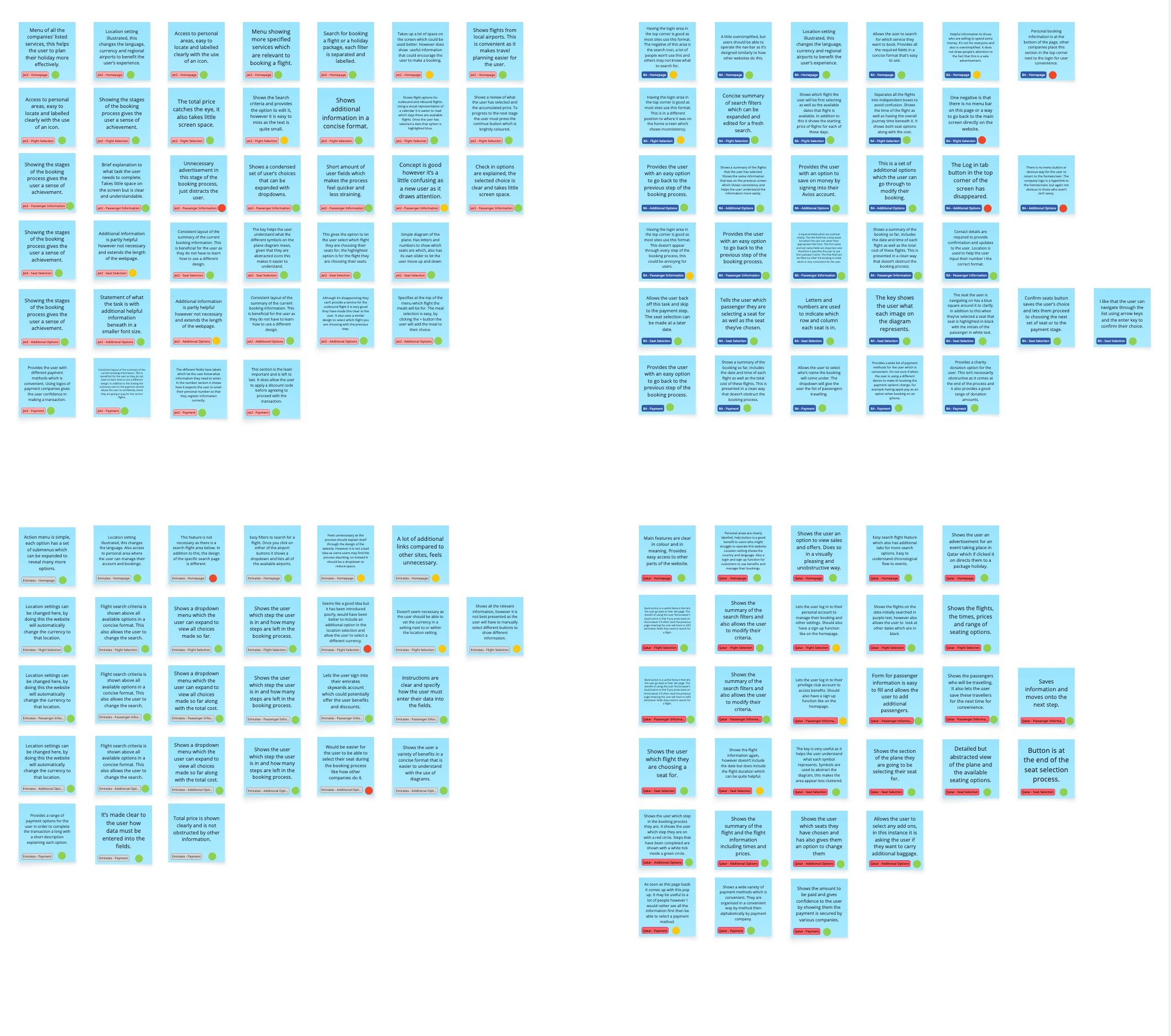 Competitive Benchmarking
 Online Survey
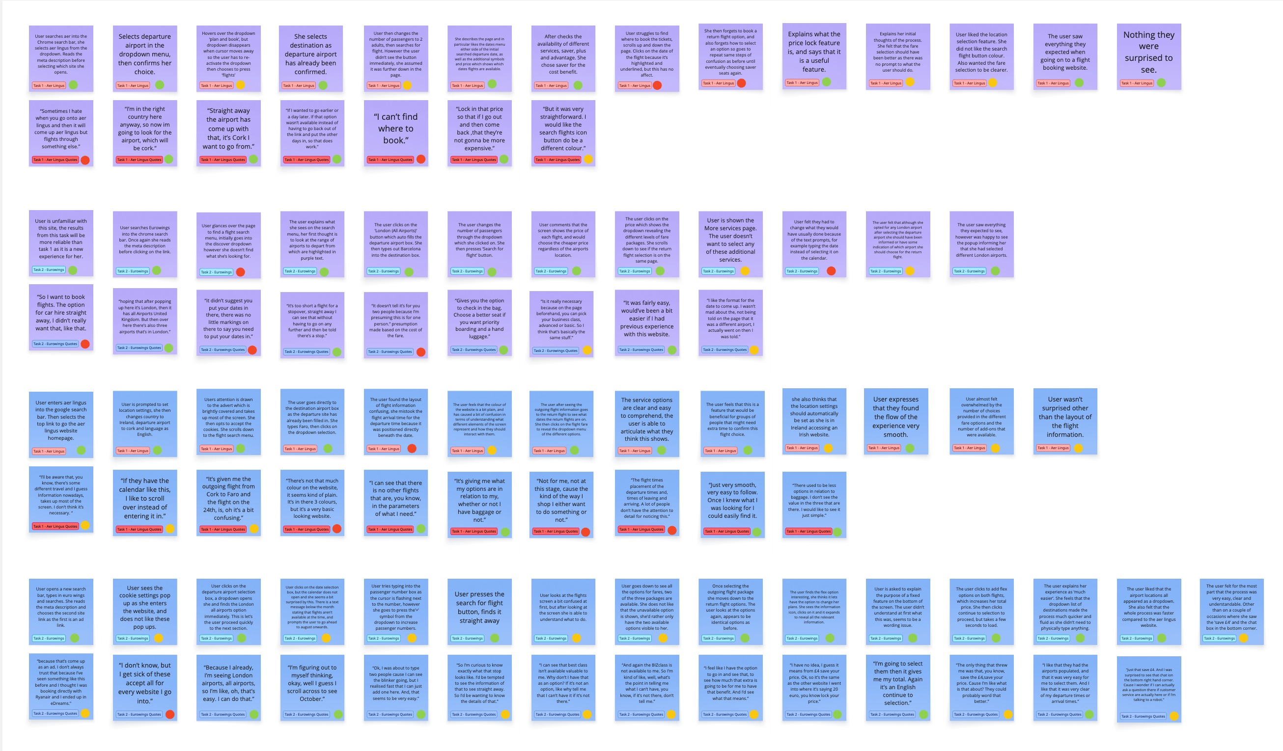 Note Taking
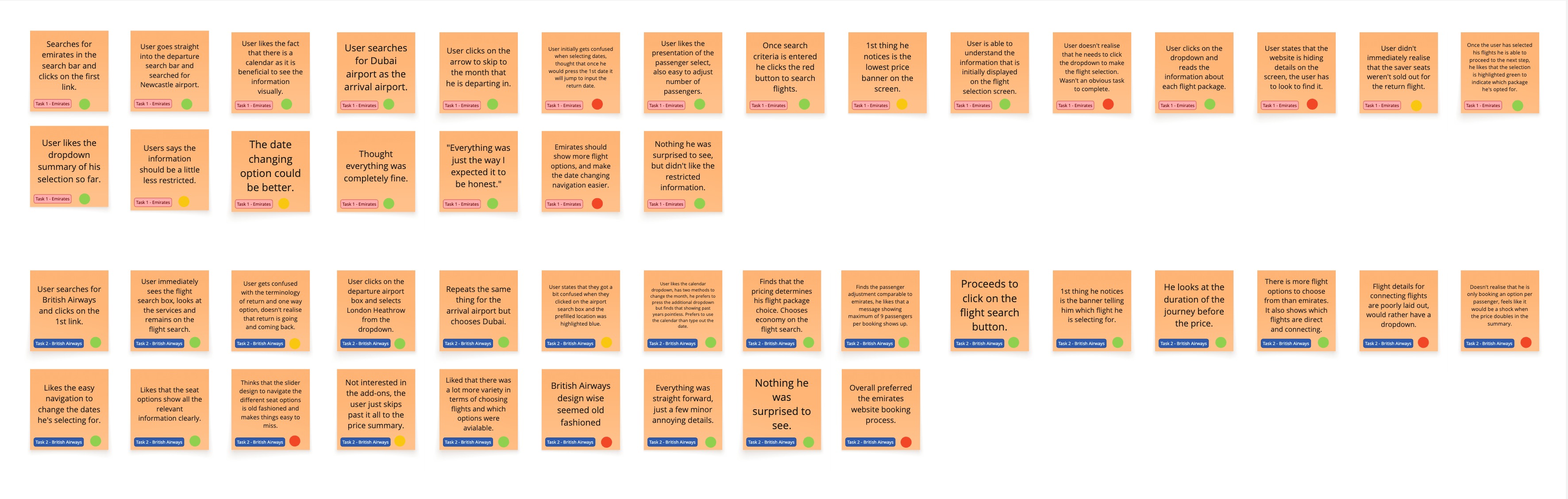 Usability Test
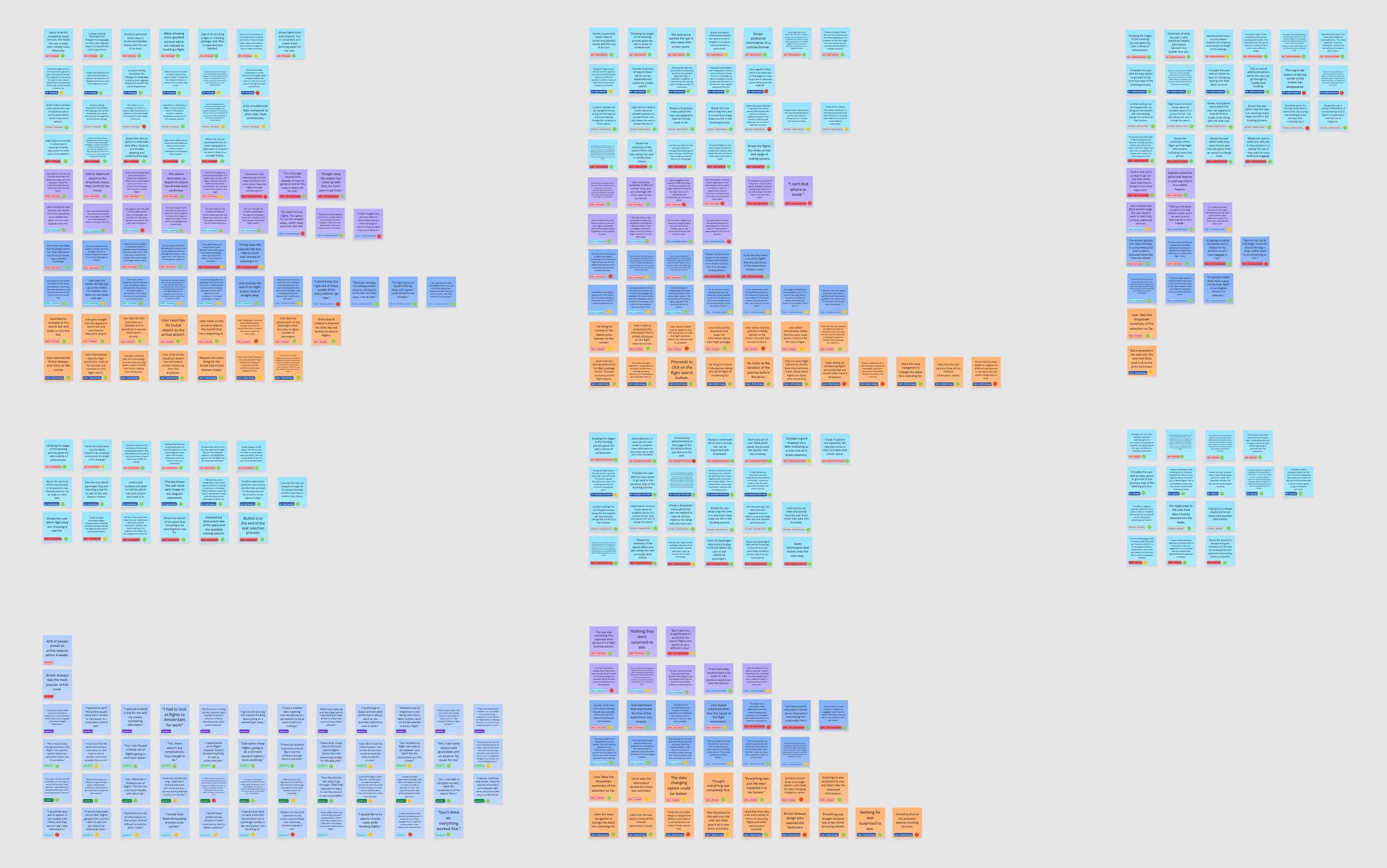 Grouping
 Label and Subgrouping
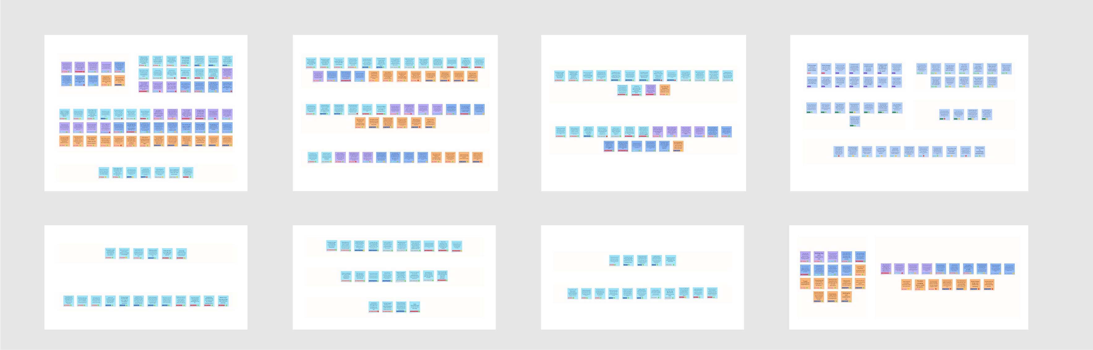
For this project I used Miro to create an affinity diagram. I undertook several passes to organise the ideas into groups and subgroups relevant to the task. By doing so I was able to isolate key patterns where I could identify recurring pain points.
Following the affinity diagram, I created a customer journey map to visualise the user's experience across different stages of the booking process. Using different screens as the different stages I identified touchpoints, actions, pain points and opportunities. Within these rows I entered data and insights gathered from the research phase.
The customer journey map from this phase was unfortunately lost from the Miro board during the project. The affinity diagrams above represent the analytical work that directly informed the flow diagrams in the Concept phase.
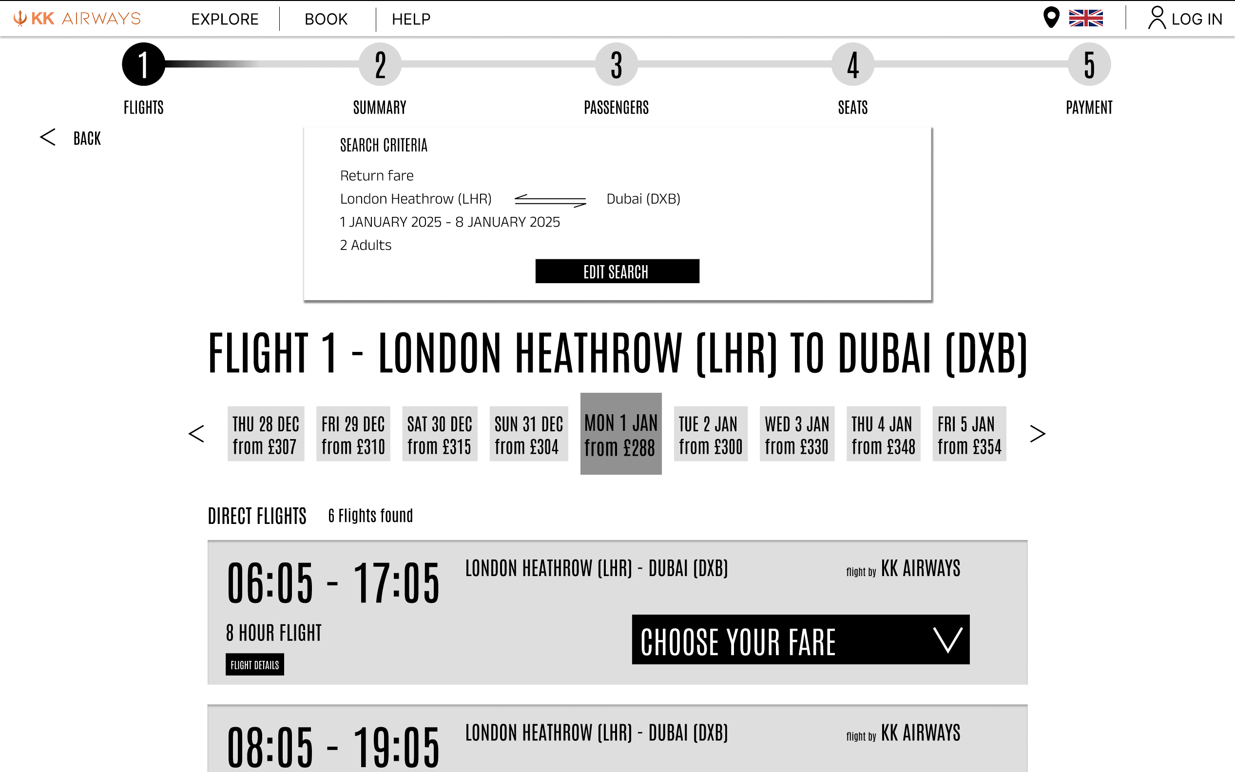
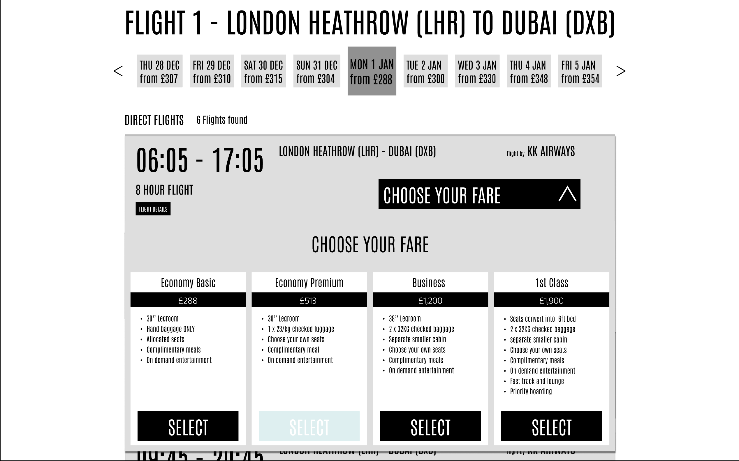
Now that we were in the concept phase I had to create a diagram to illustrate the main user flow. The flow started from the initial point of contact where the user opens the website and follows through the steps required to book a flight. To show the different elements of the flow I used a combinations of shapes to represent Screen content, Processes and Decisions.
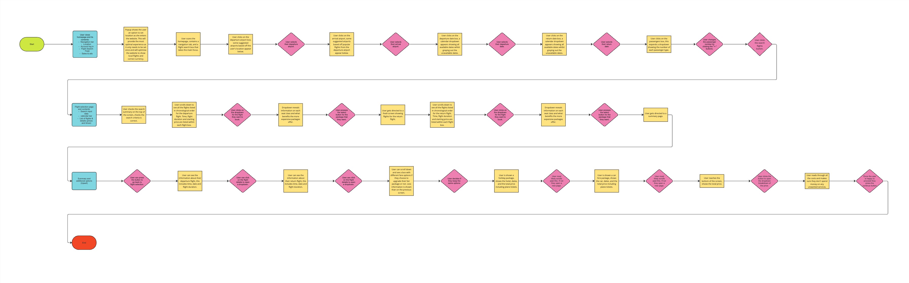 User flow diagram mapping the complete airline booking journey
Using the flow diagram as a foundation, I then began conceptualising the interactions for each screen. I started by creating low-fidelity wireframes and made some paper cut outs which I used to create recreate elements which not only saved time but allowed me to experiment with different layouts. To add further detail I outlined the features present on that screen as well as a brief description of their functionality.
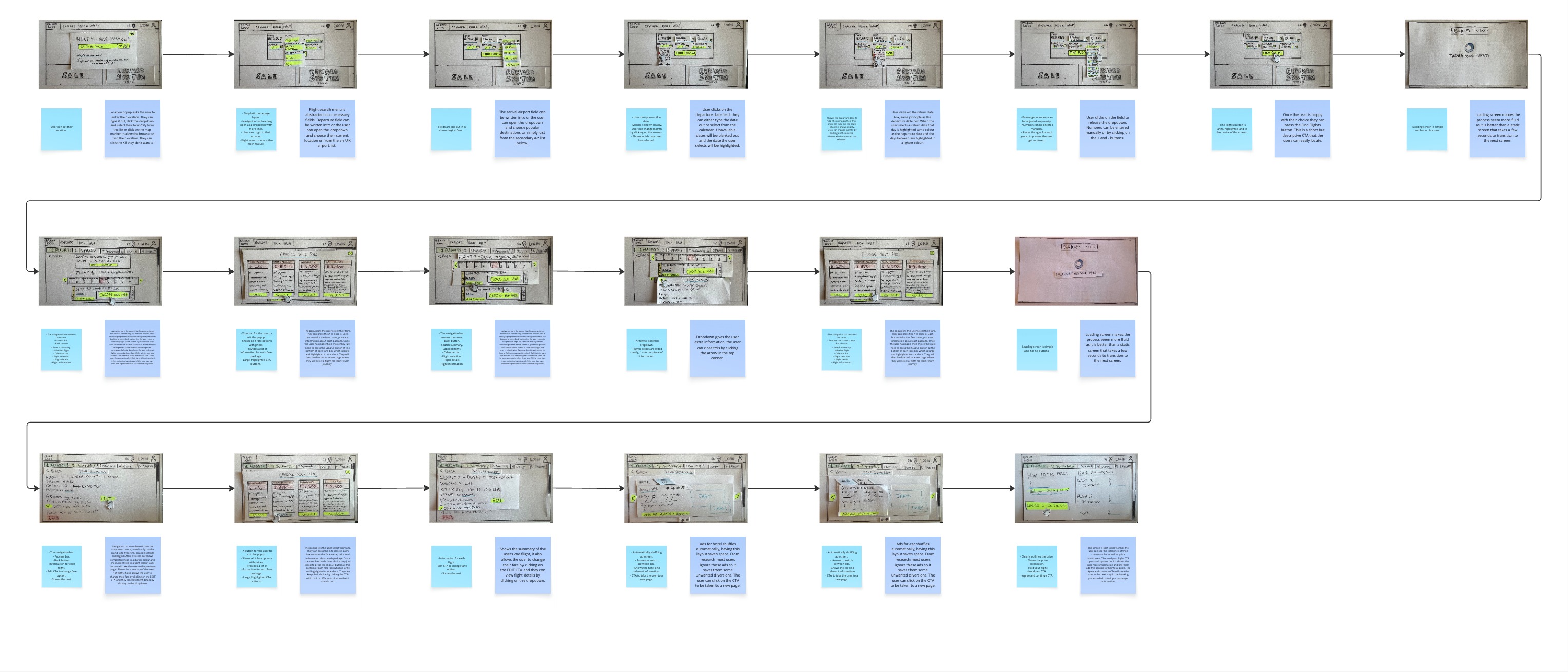 Low-fidelity interaction sketches annotated with design decisions
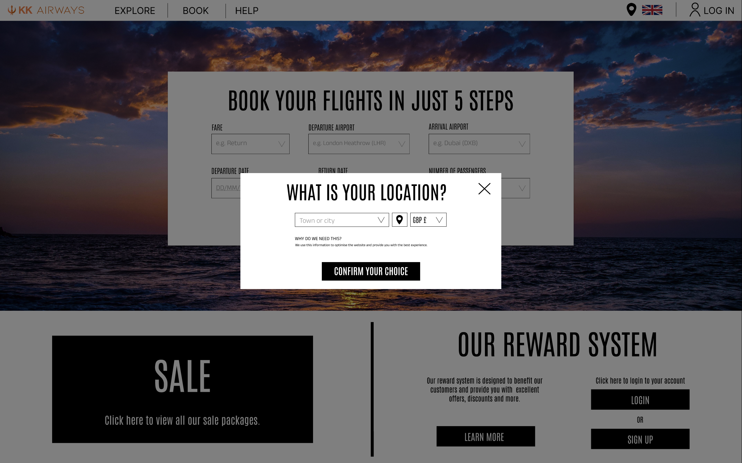
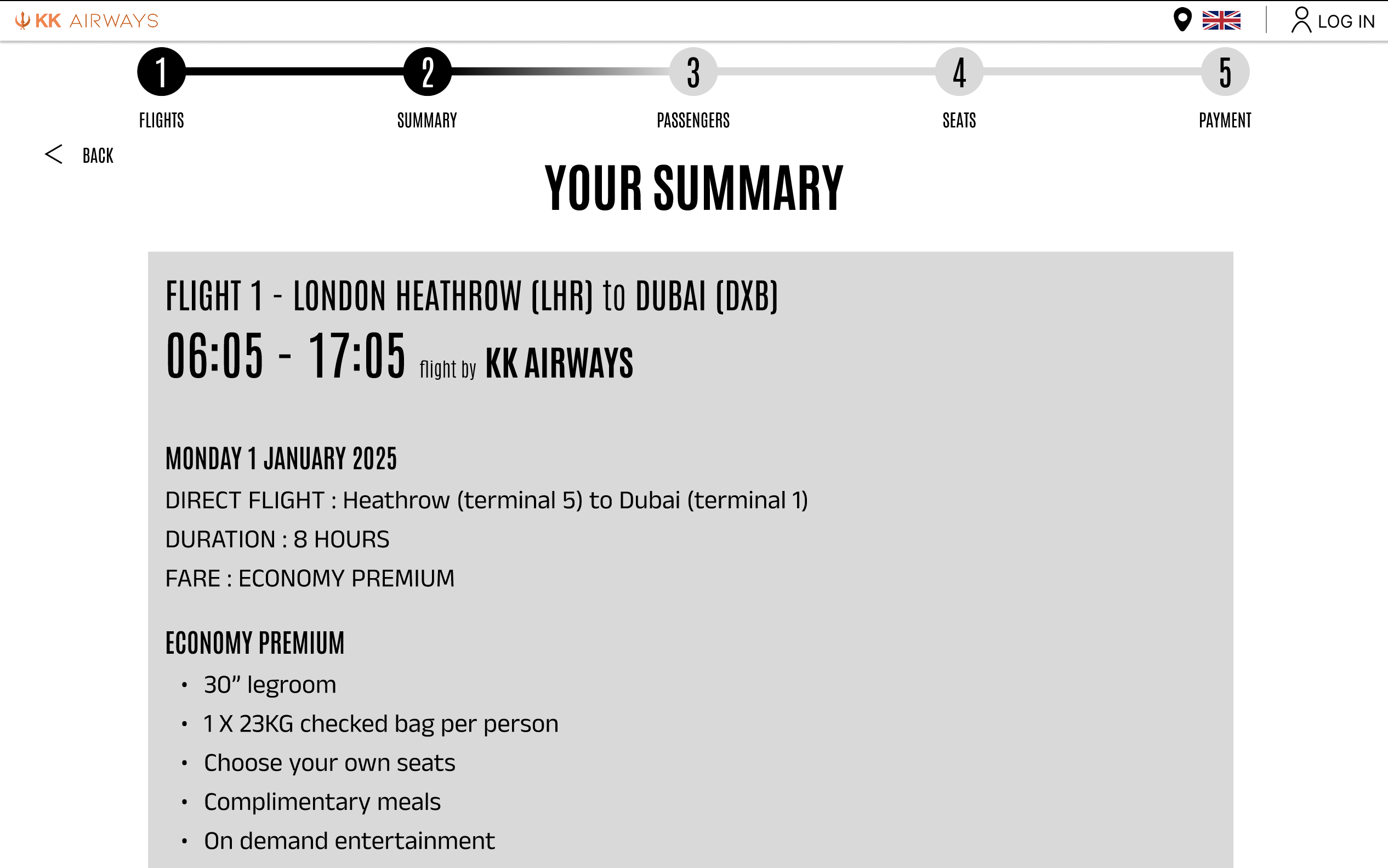
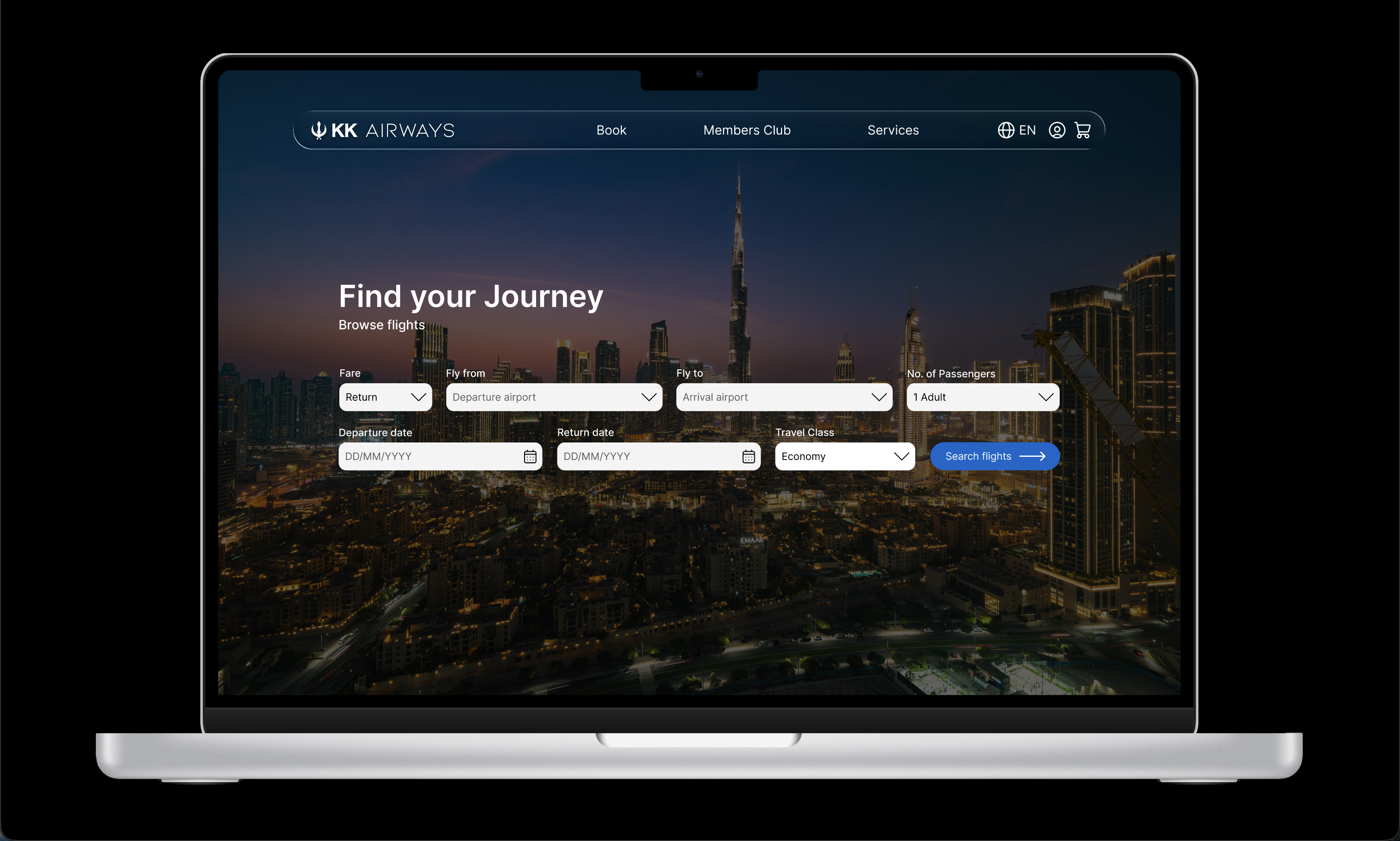
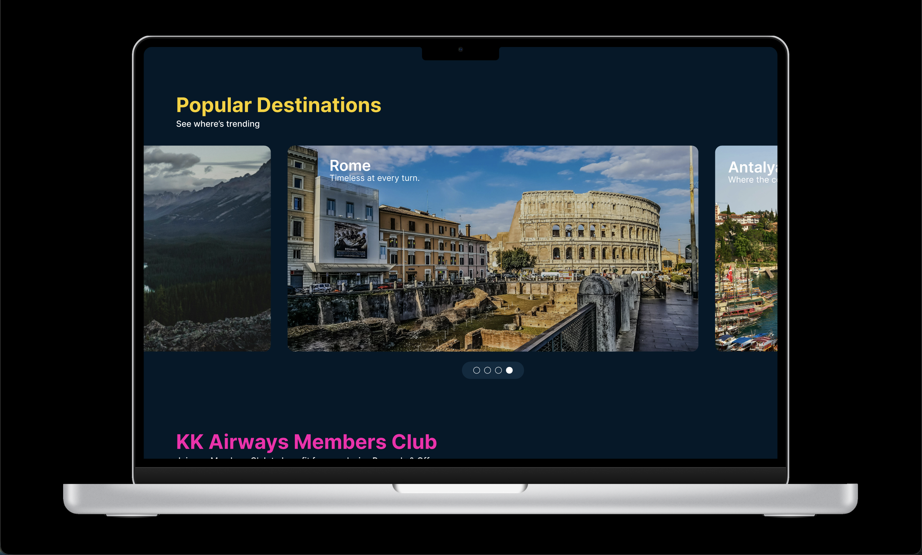
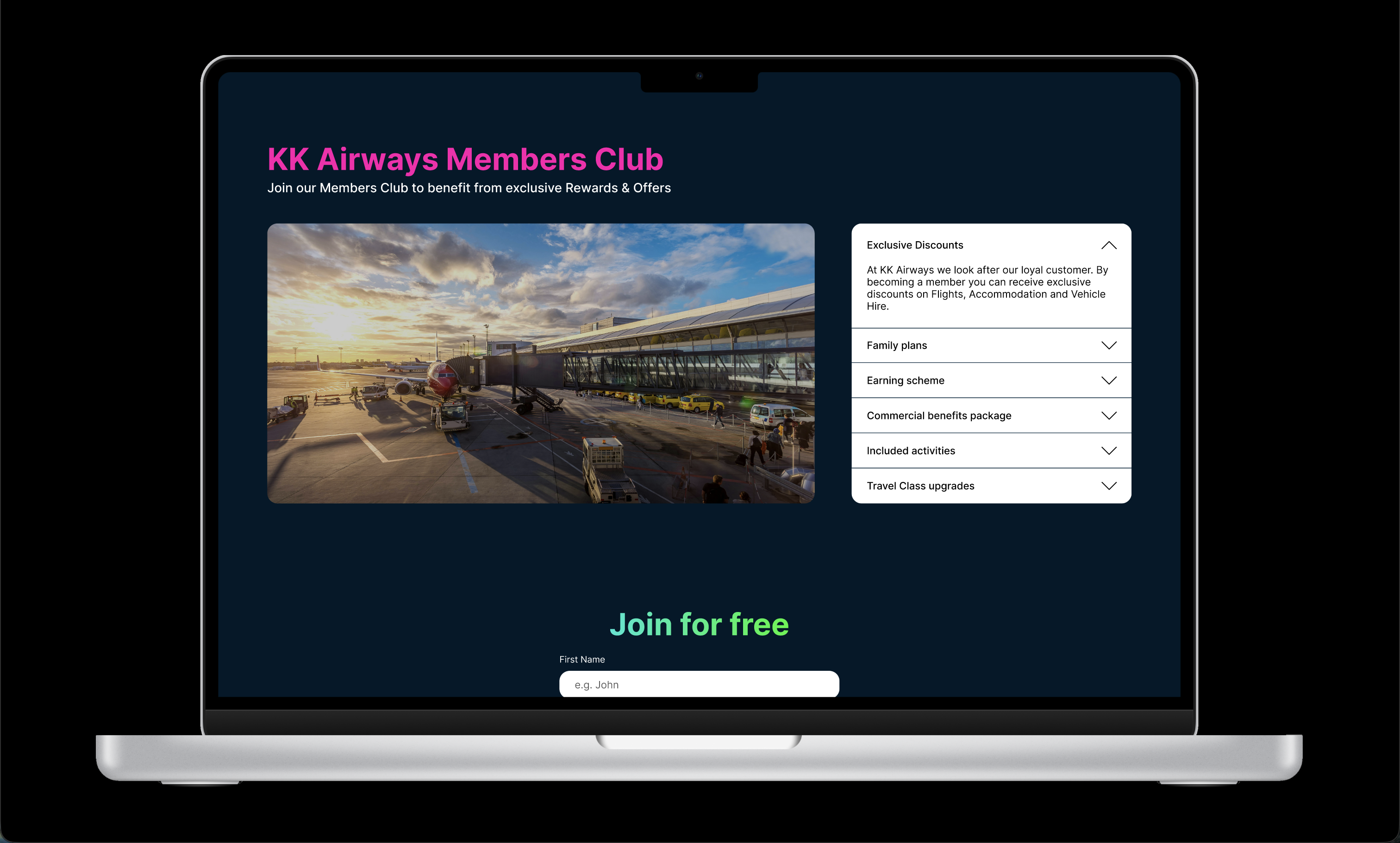
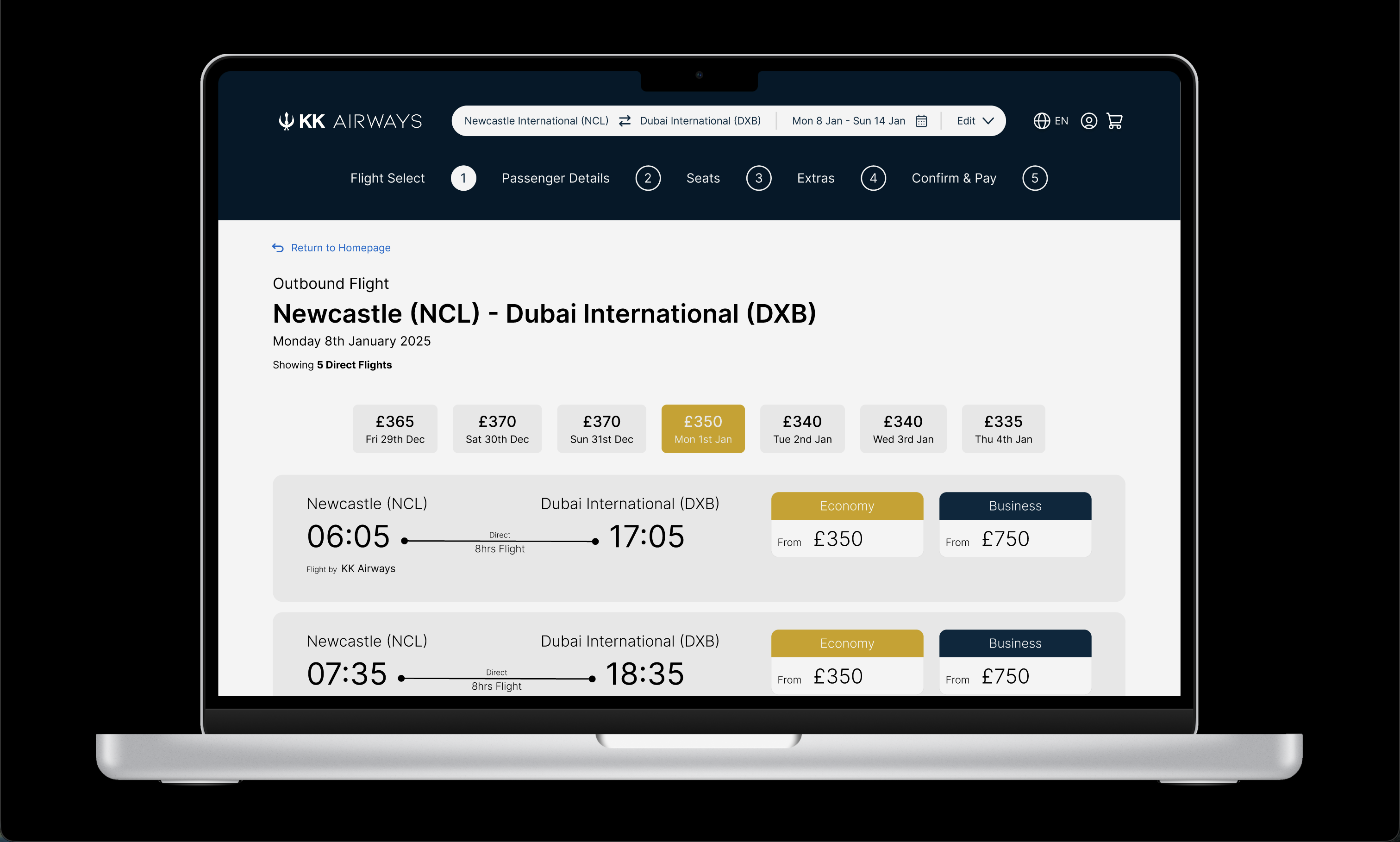
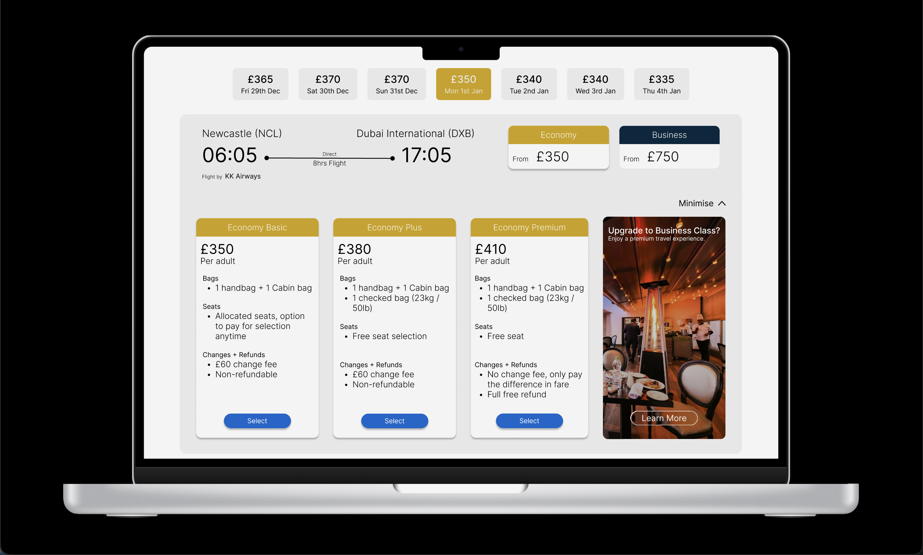
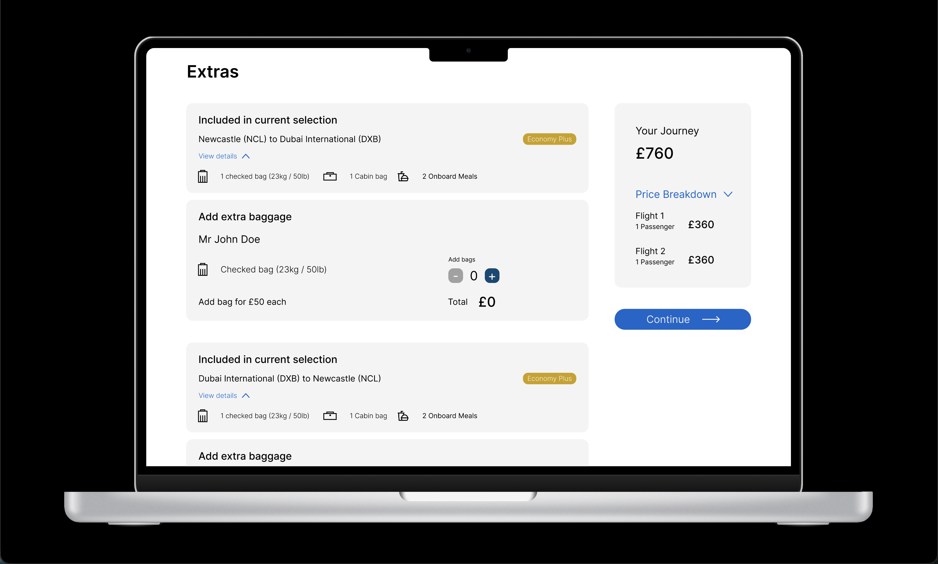
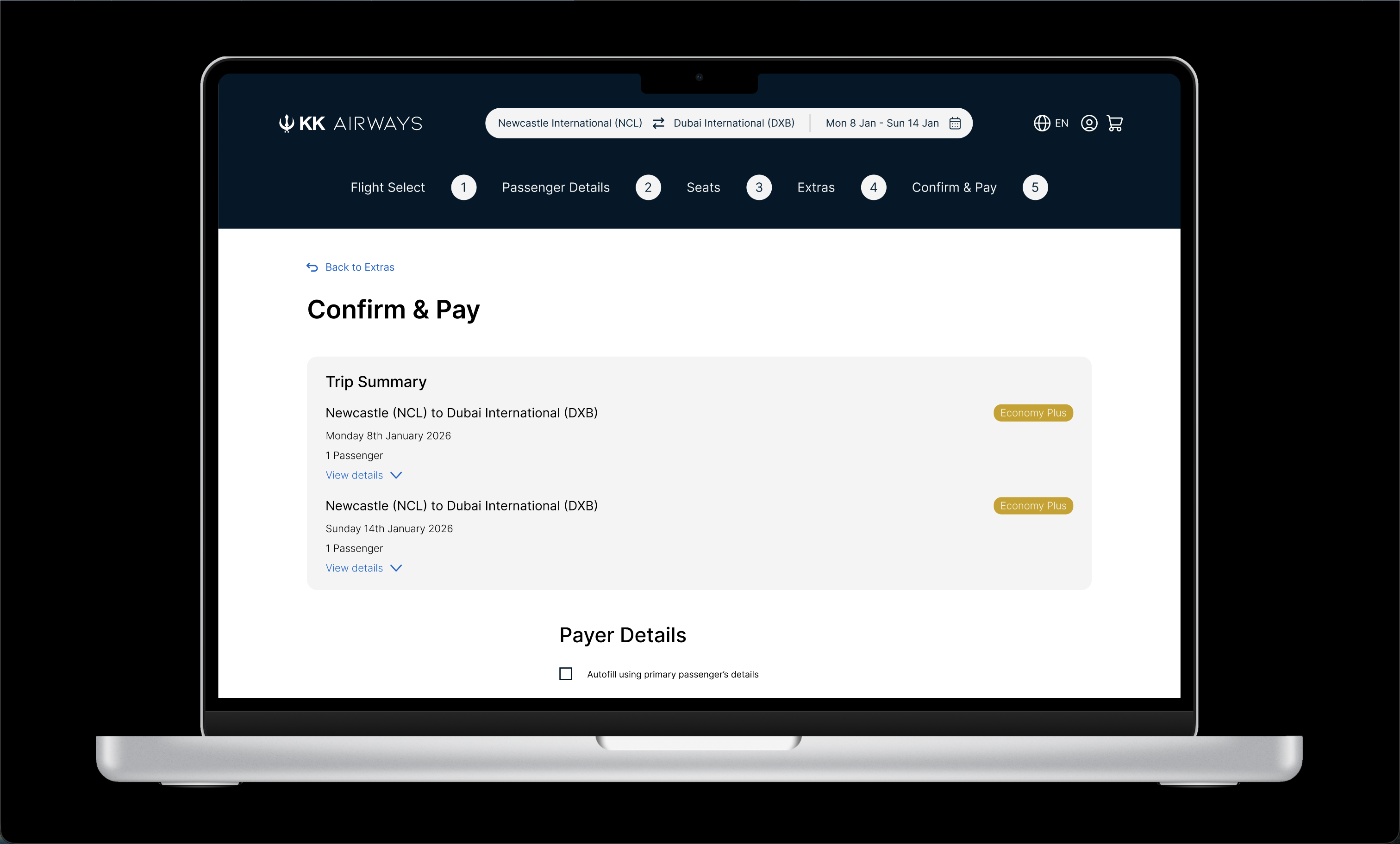
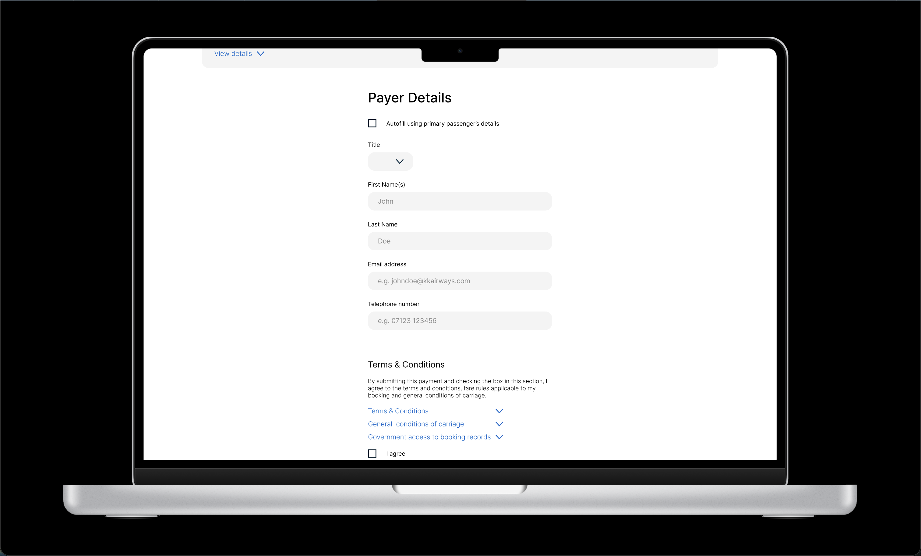
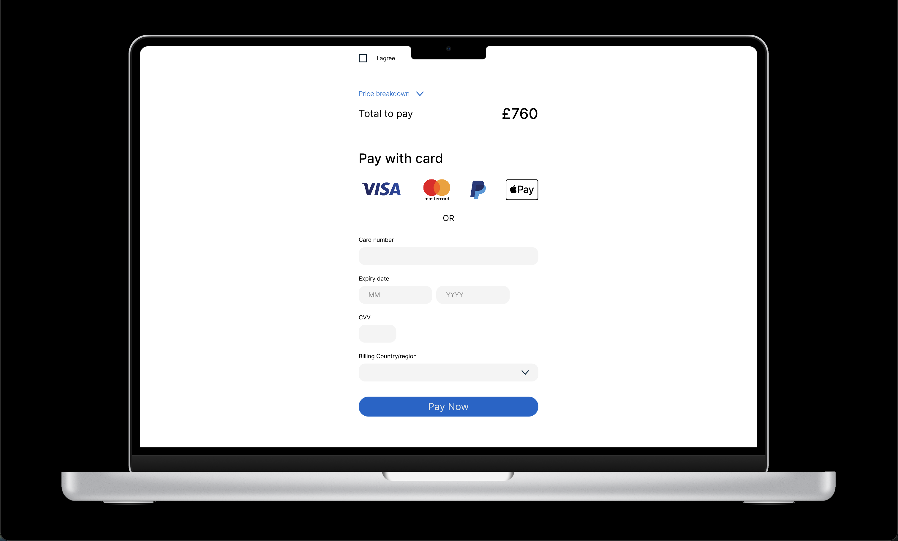
Using the wireframes as a guide I began creating an interactive prototype using Figma. At first this was tricky, learning a new software had its challenges but I persevered and became profficient enough to create a functional prototype. Factors like visual hierarchy and user feedback influenced the design.
One area in which I know I could have improved was the UI design. At first I designed a very simple interface with minimal styling, the reason for this was to focus on the problem at hand. Despite this I did receive a lot of positive feedback from my tutors regarding the usability and overall user experience.
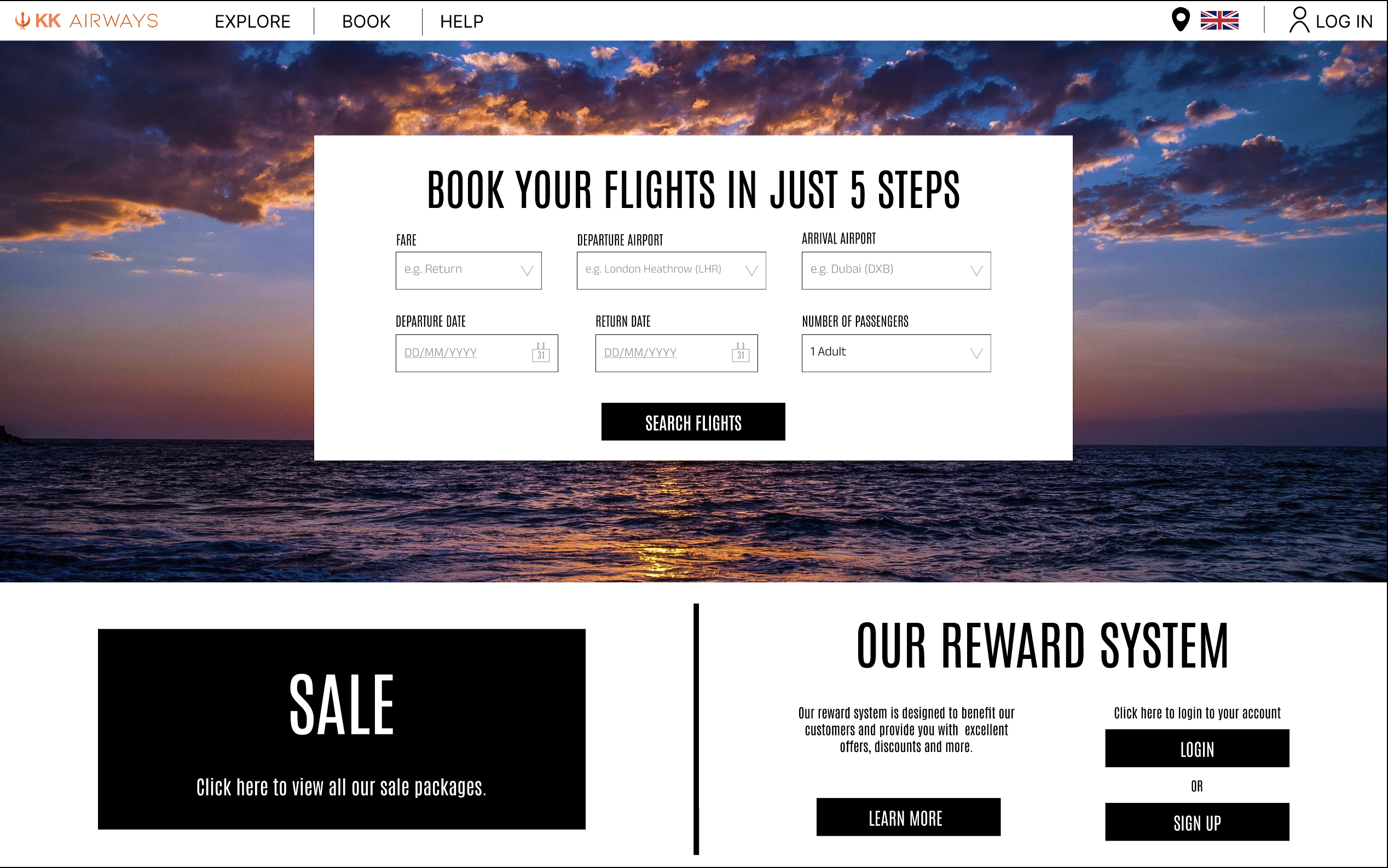
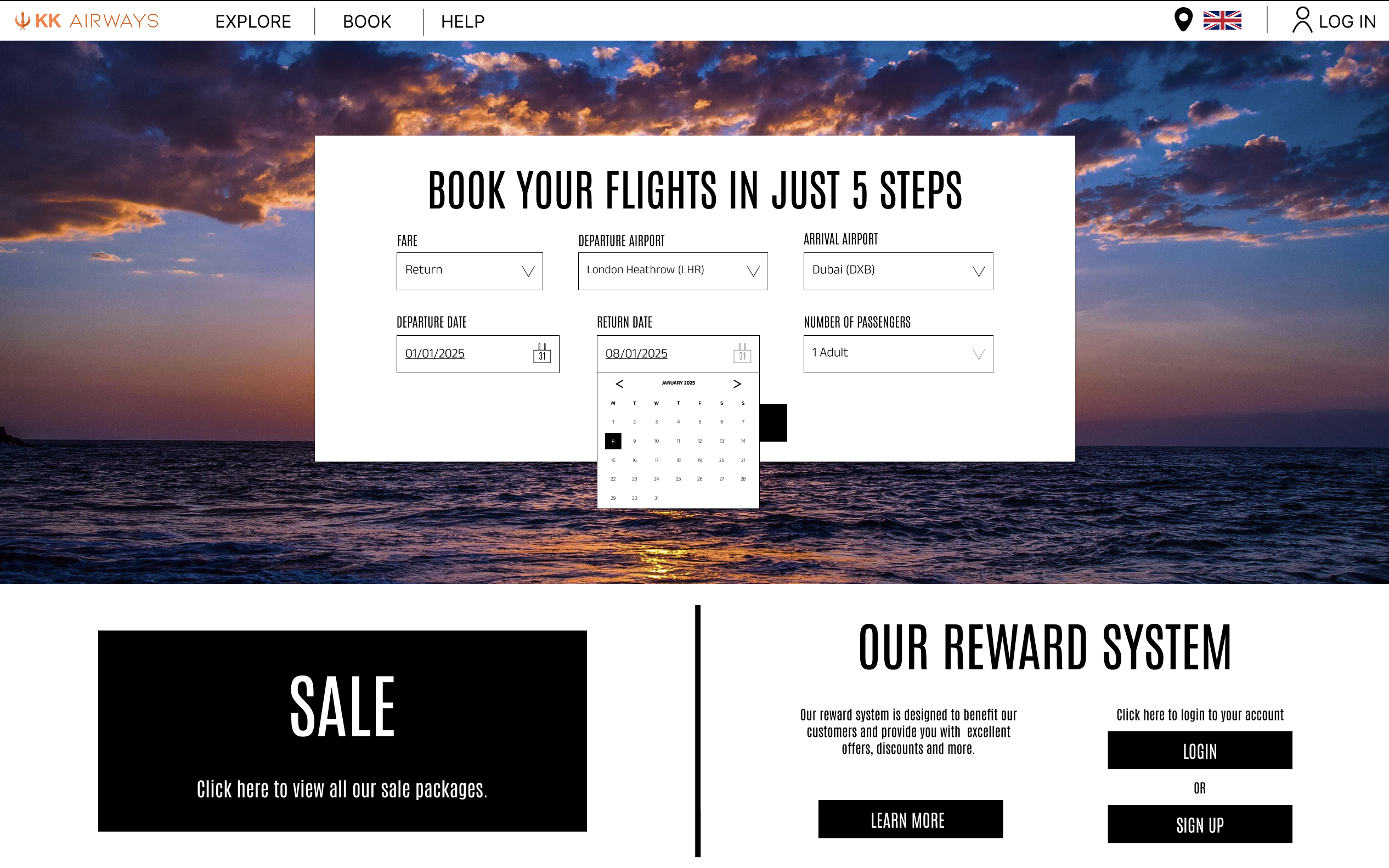
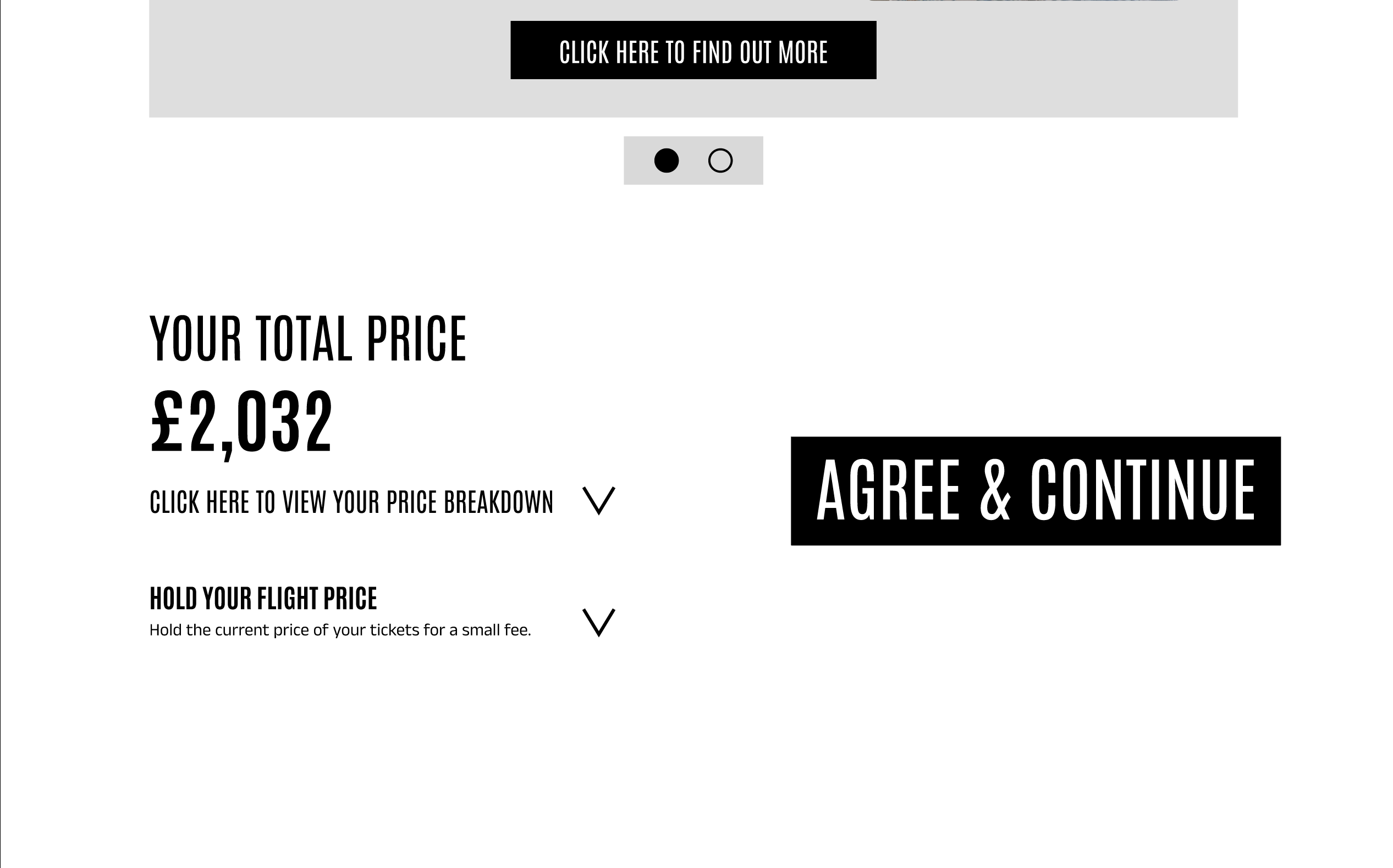
To maintain a user-centered approach, I conducted further usability tests to validate design decisions and gather constructive feedback as to what could be improved. As expected the feedback was largely positive. I found that the users had little friction navigating the booking process and valued how the streamlined experience would impact their perception of booking flights.
The final project of the curriculum was centered the idea of project handoff. A key principle was learning the importance of specificity and how detailed annotations can be used effectively to reduce the risk of errors during development. Using Figma's commenting function I added detailed annotations to my prototype explaining the design rationale and outlining how elements should interact with the user to improve UX.
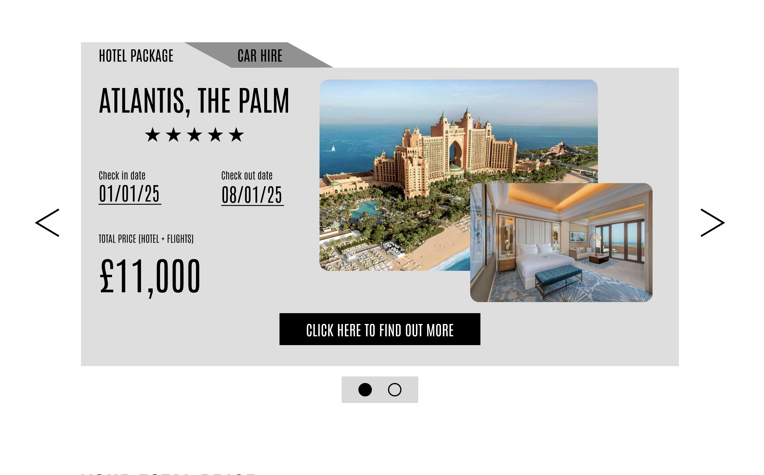
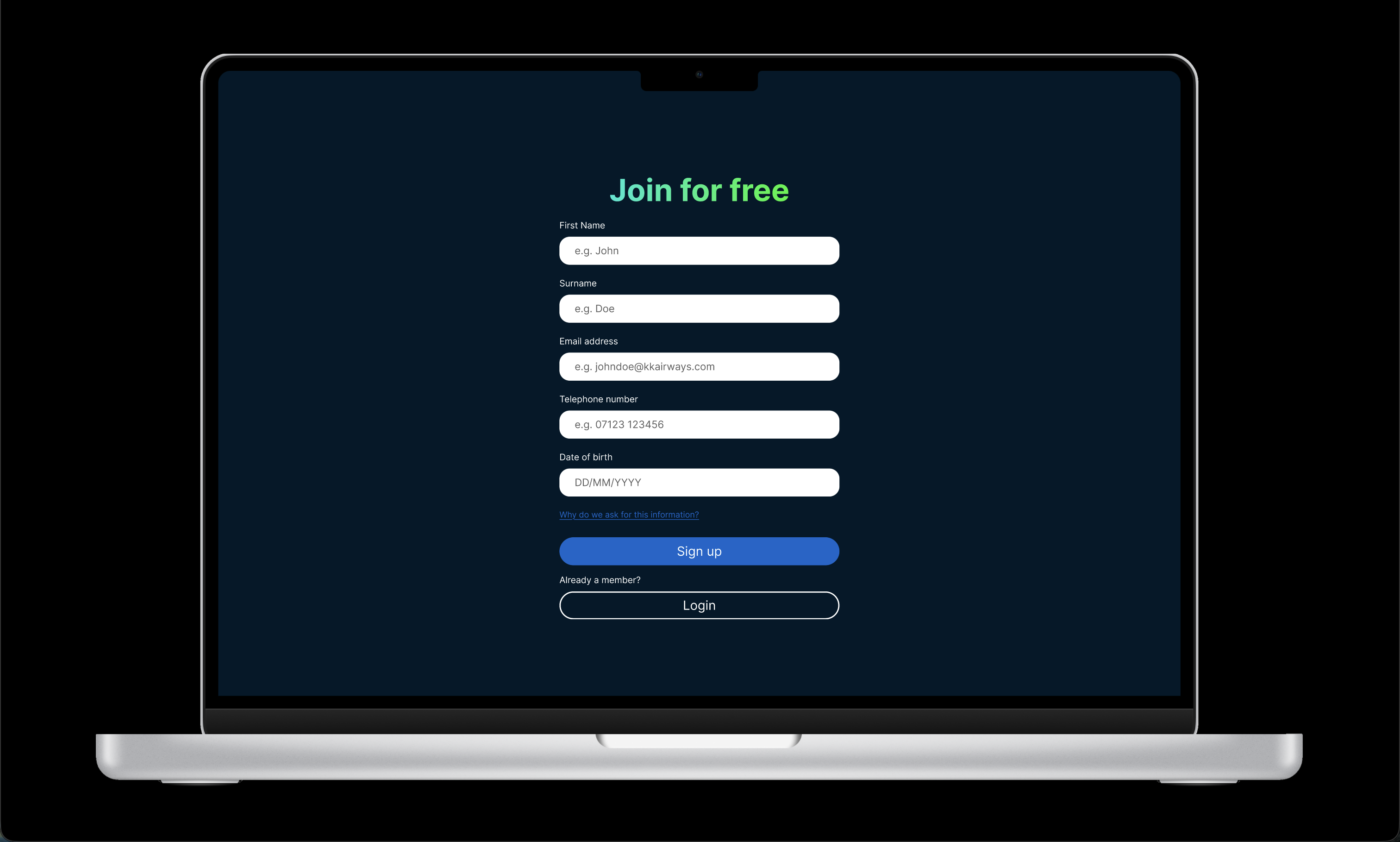
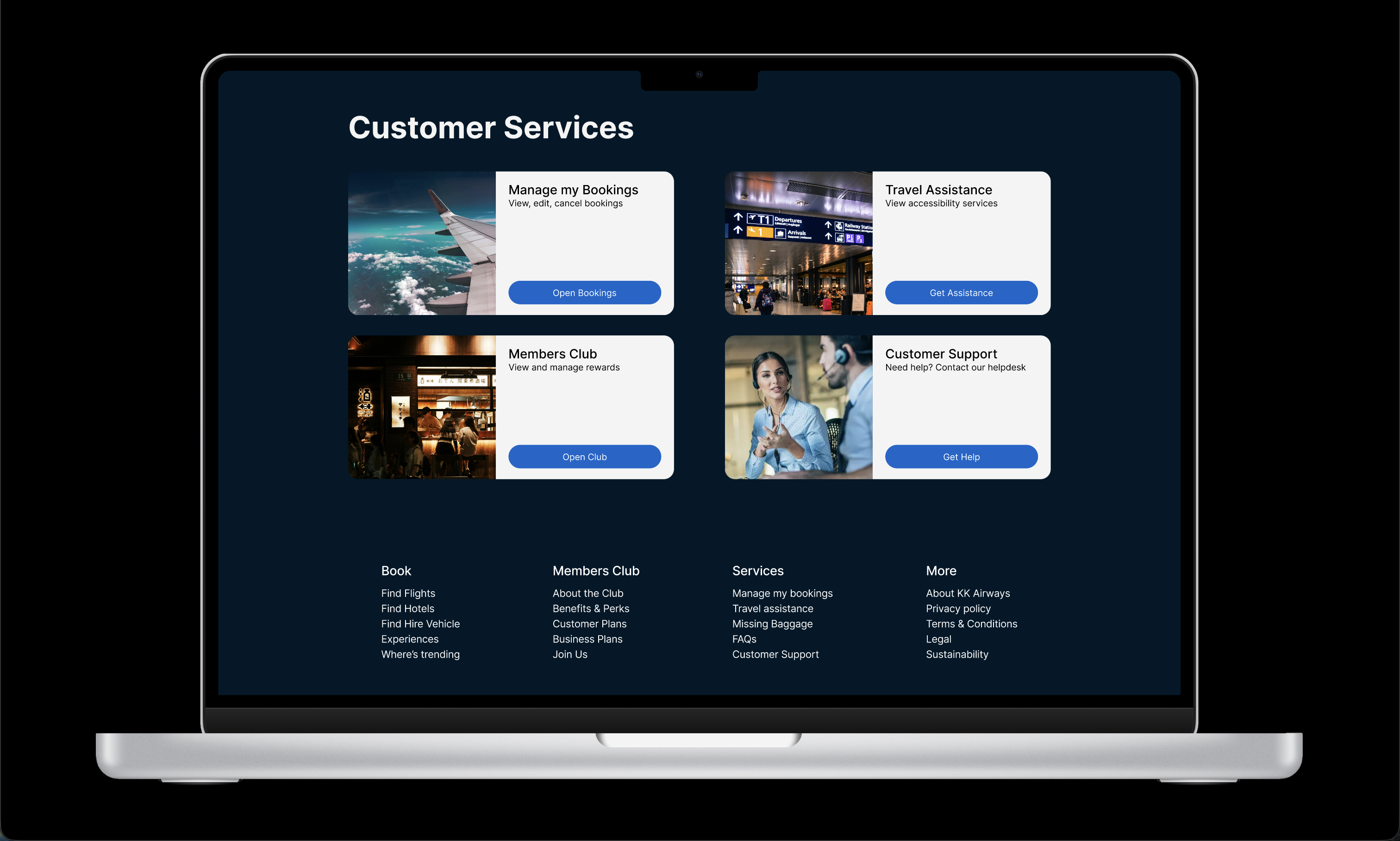
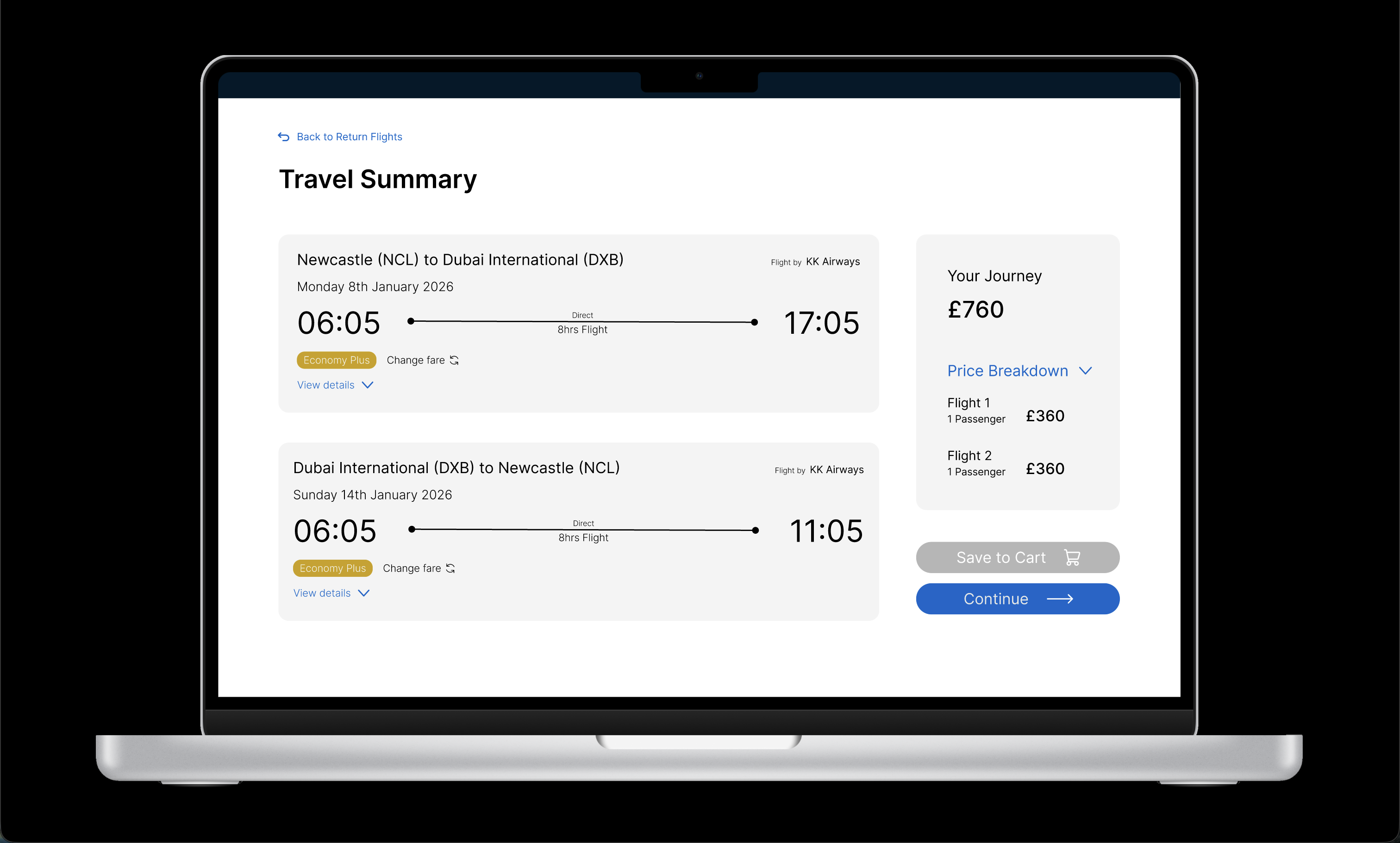
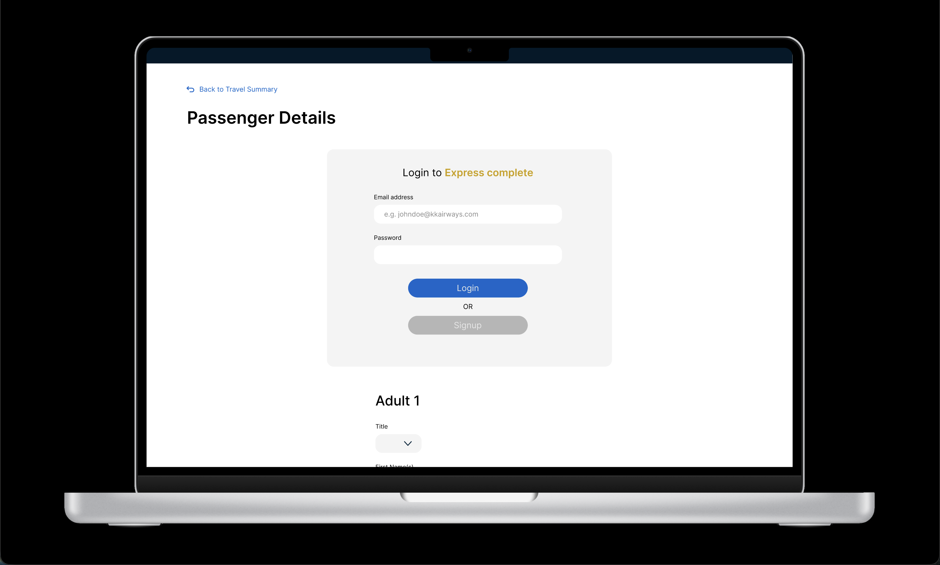
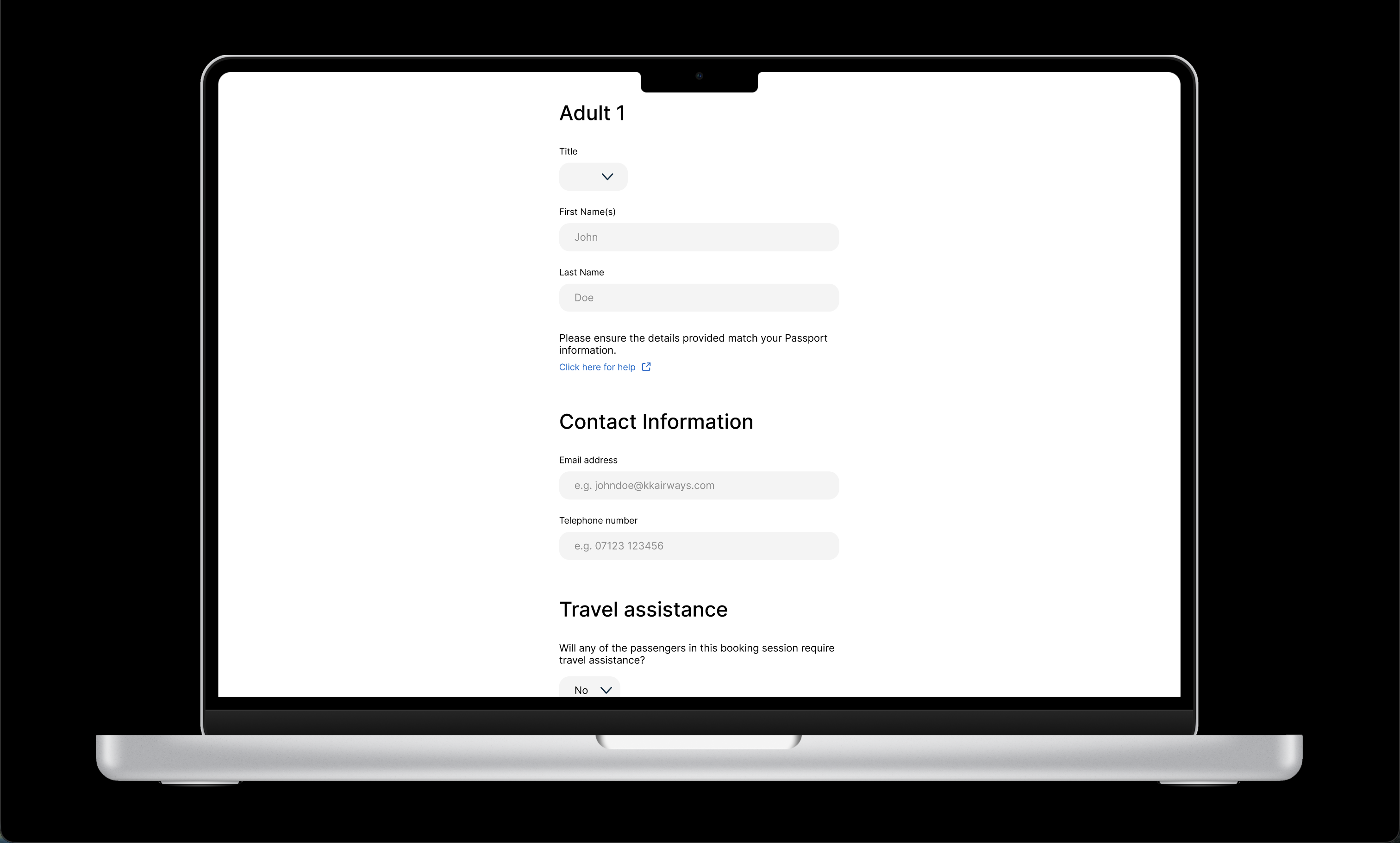
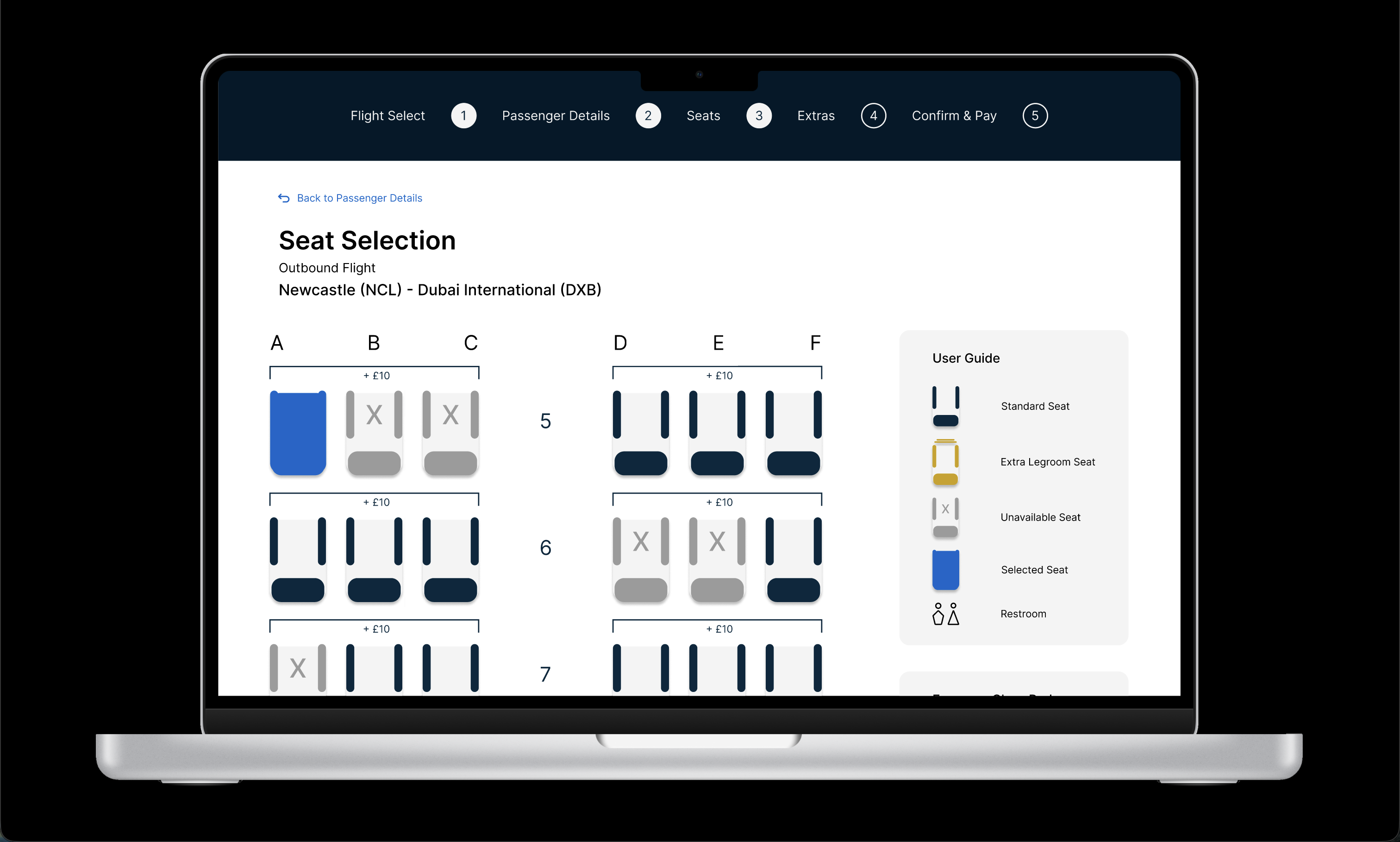
After completing the course I revisited the design with fresh eyes and a stronger foundation in UI. I rebuilt the interface from scratch in Figma — darker, more immersive, and visually cohesive. The booking flow was refined, the navigation made more intuitive, and the visual language brought closer to industry standards.
If I had more time I would have conducted more extensive research on UI design. Not only would this have improved the overall quality of the experience but it would have also allowed me to explore more innovative solutions. At the time I was primarily focused on Design principles like Hick's Law and Visual Affordances to aid the user during the booking process. The reason I was so restrictive of myself was to ensure I'd meet the targets for success provided by the curriculum.
Another factor which limited my designs was the lack of experience using Figma. As this was my first time with the software I struggled with the learning curve, after repetition I did manage to learn how to use feature like auto layout and components. As a result of this I was able to redesign the UI and vastly improve the visual perception of the website.
Moving forward I plan to experiment more with Figma which I believe will further enhance my design capablities. I consider myself a logical thinker which is why I prioritize data-driven decisions in my design process. I'd like to continue building on the foundation I've established from course by exploring a wider range of successful products and analysing how design decisions make the user experience so effective.