Budget - Managed a £1,000 budget to procure a developer.
Project lead - User Research, User Flows, Wireframing, UI Design, Prototyping
James Rothwell - MD
Adam Vernon - CGO & Web Dev
Niral Malani - Web Dev
June 2025 - 2 Week Deadline
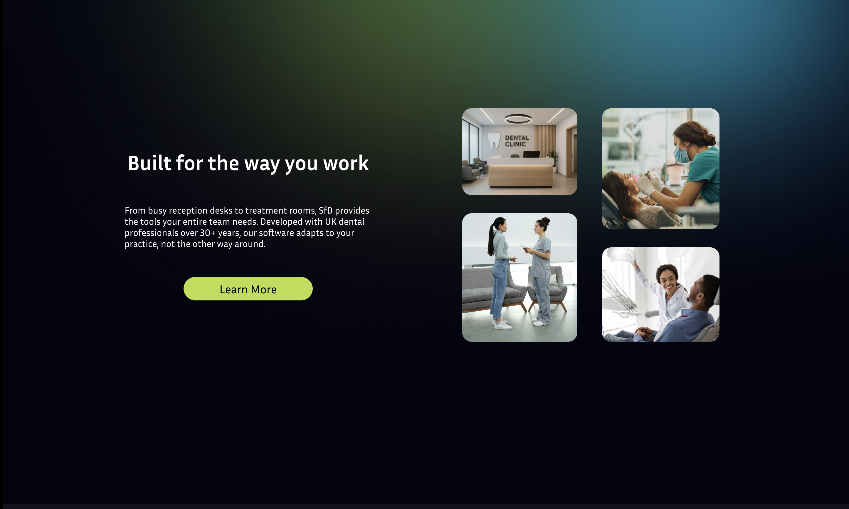
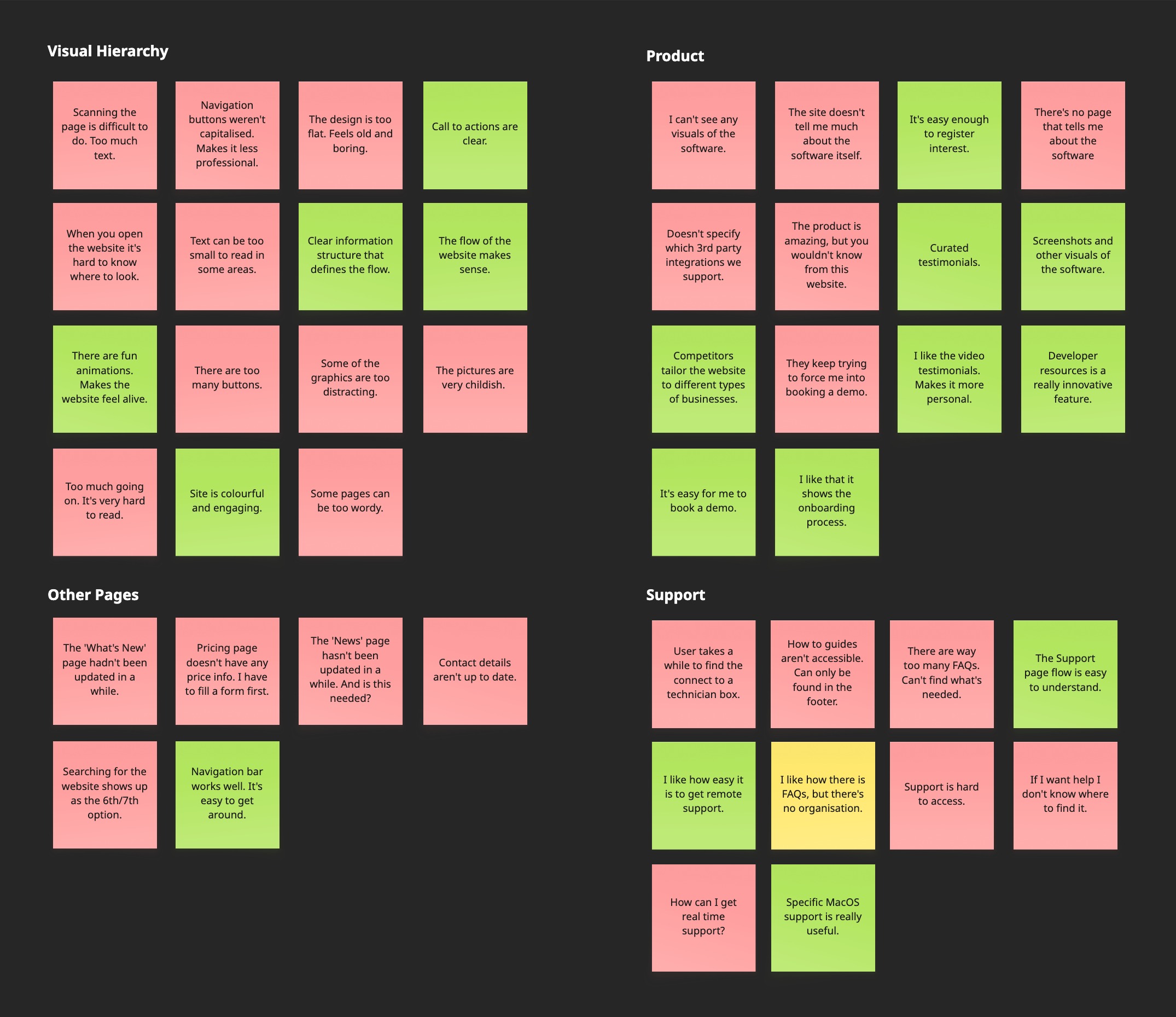
The existing website was old and dull. There was no clear user flow and worst of all it was all just plain block text. This lead to user disengagement.
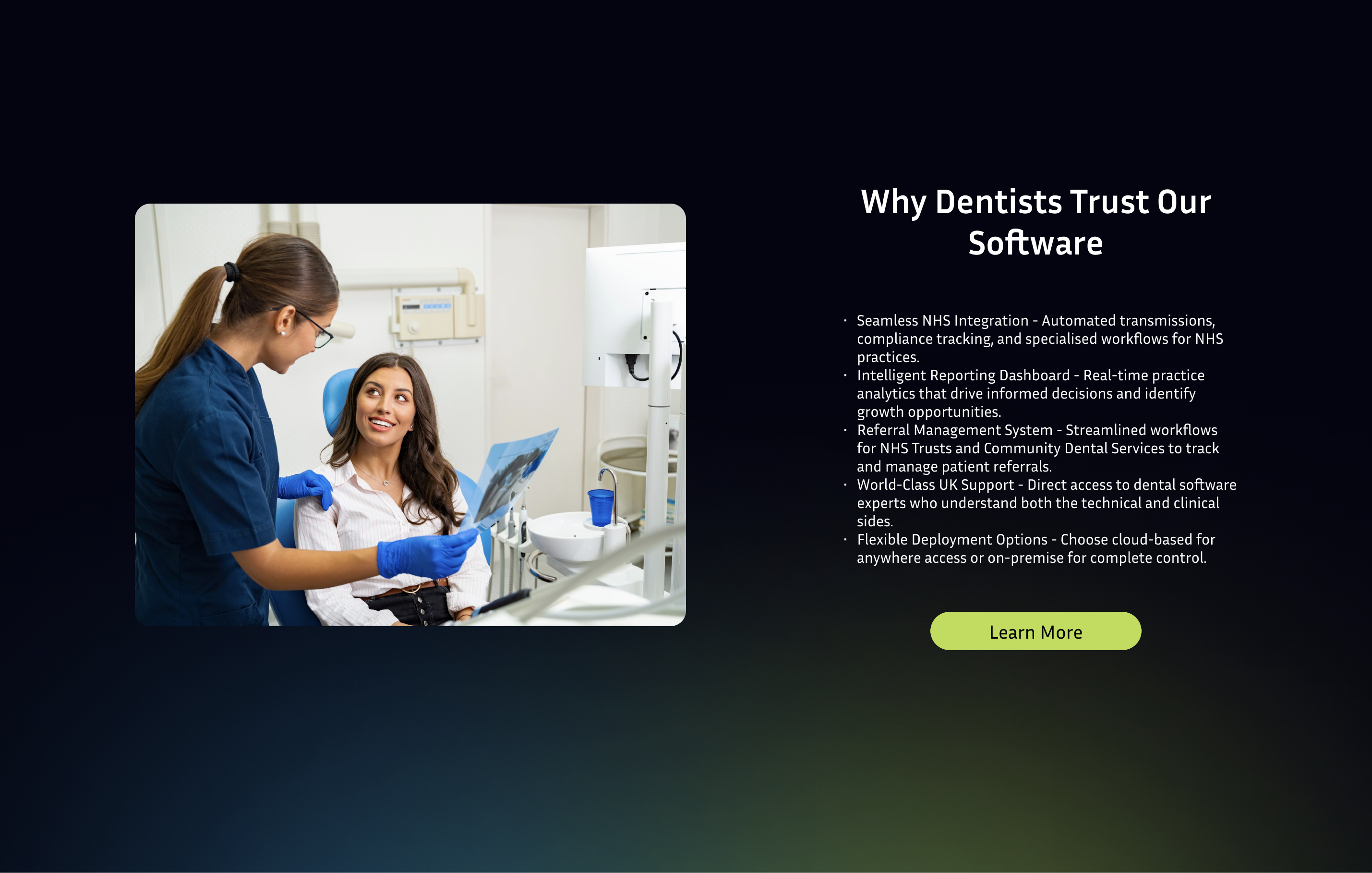
The goal was to create a modern website focused on driving business growth. The new website needed to boost SEO, advertise the product and optimise customer support.
Budget - Managed a £1,000 budget to procure a developer.
Business Growth - Boost sales & simplify access to support.
Improve SEO - Drive organic visibility & improve search rankings.
Streamlined Navigation - Identify & create clear user flows.
Dark Mode - Reinforces a modern, brand-aligned experience.
Meet the Deadline - Rapidly develop the website in 14 days.
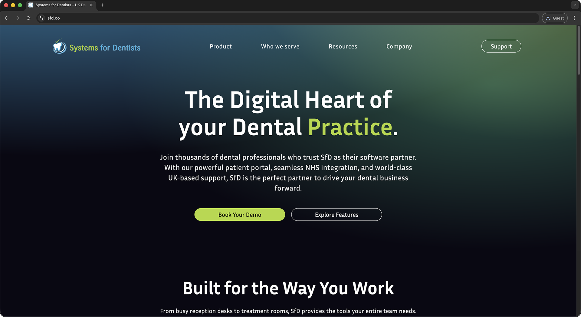
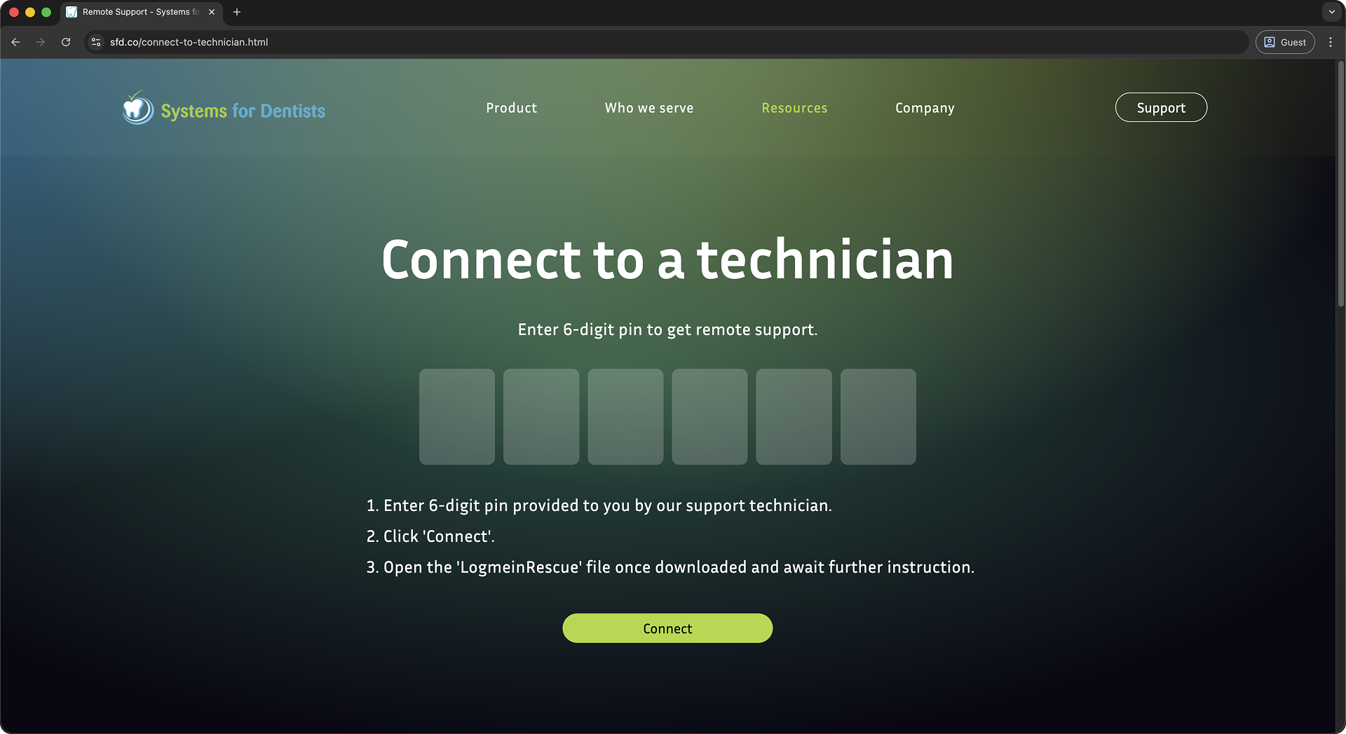
There are 2 main user flows for users accessing the SfD website. The first being the ‘Connect to a Technician’ flow and the next being ‘Book a Demo’.
I gathered research by asking existing users what they thought of our website, whilst I was working as a support engineer I was fortunate to view how they interacted with the website. I also analysed competitor solutions to see how they approached the problem.
This is the main User Flow we would need to design around. The current solution was thought out well, in just 3 steps the user could complete their task.
User clicks 'Support Homepage' button from the SfD software.
User enters OTP provided by technician then clicks 'Connect'.
User opens the 'LogMeIn Rescue' file to start remote session.
The original design of this page did create some issues. Just like the rest of the website there was no clear hierarchy. This made the support process slower and decreased the task completion rate.
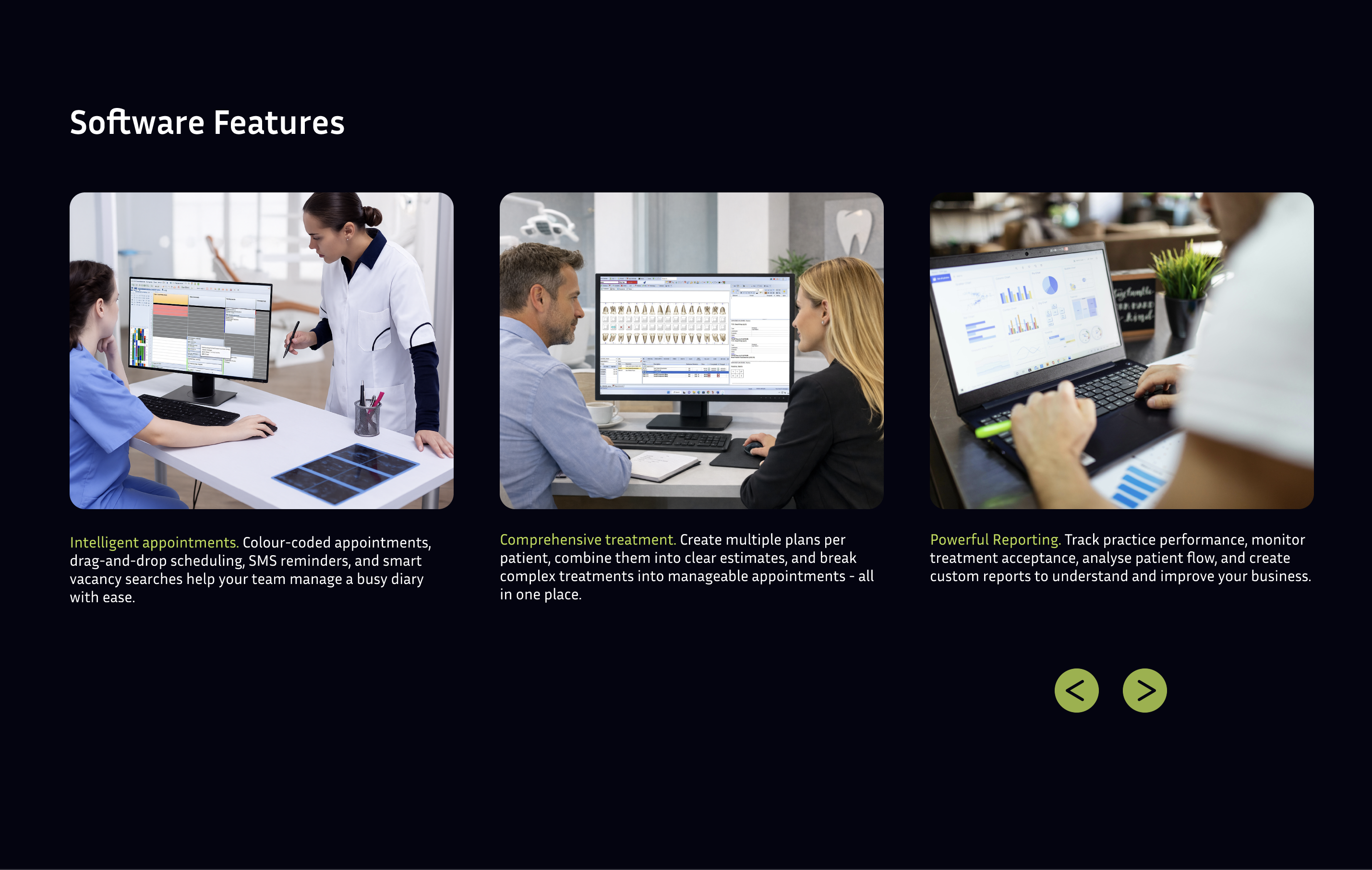
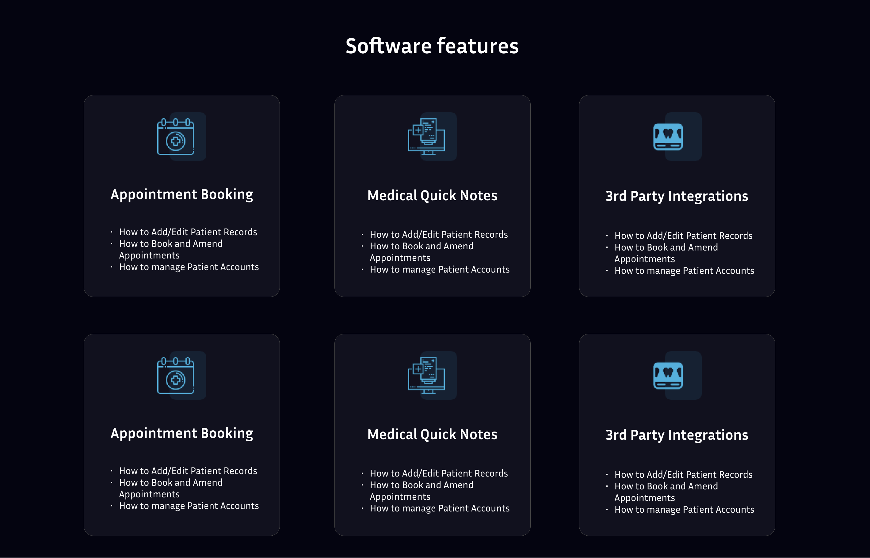
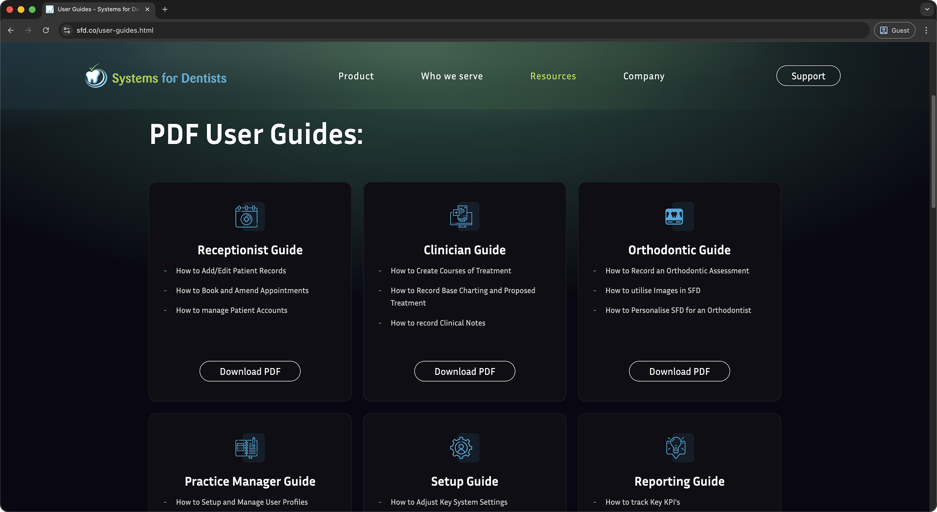
From the brief I was told that we would need to copy the content from the existing website. In order to optimise the design we had to organise the existing content into digestible chunks.
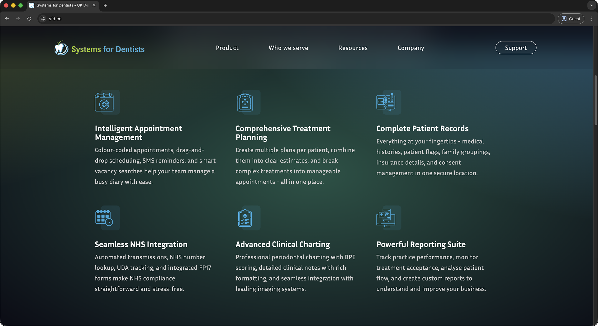
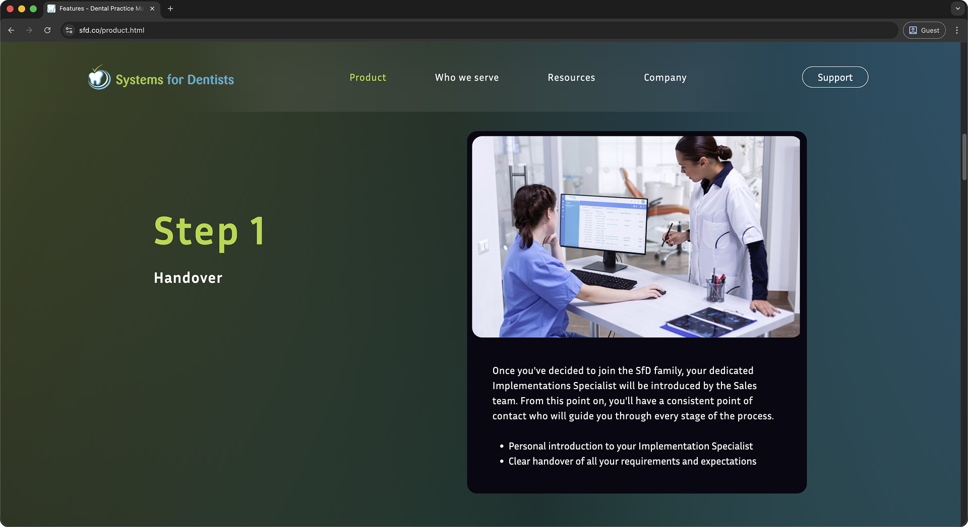
Software - Contains details on the product and transition process.
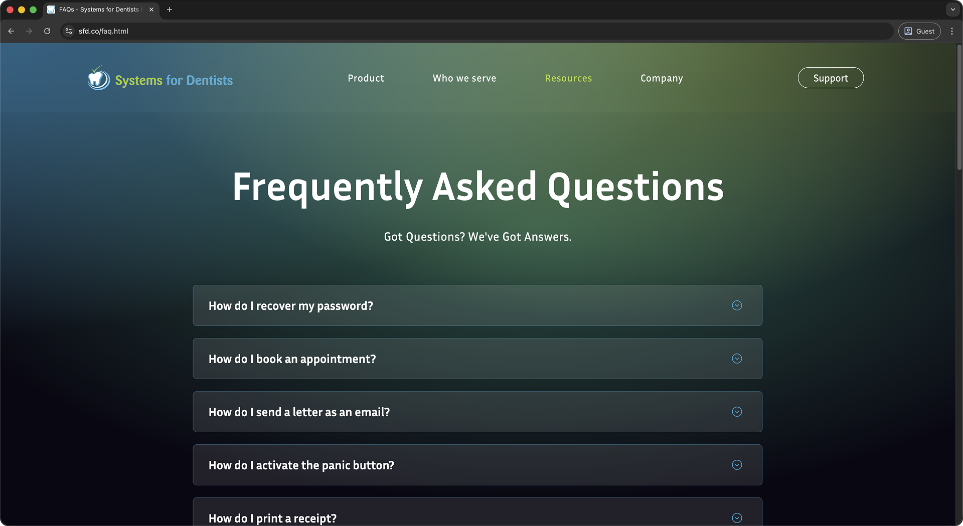
Support - Contains all the resources customers would need.
About us- Helpful information about the Business.
More - Everything else including Testimonials and Resources.
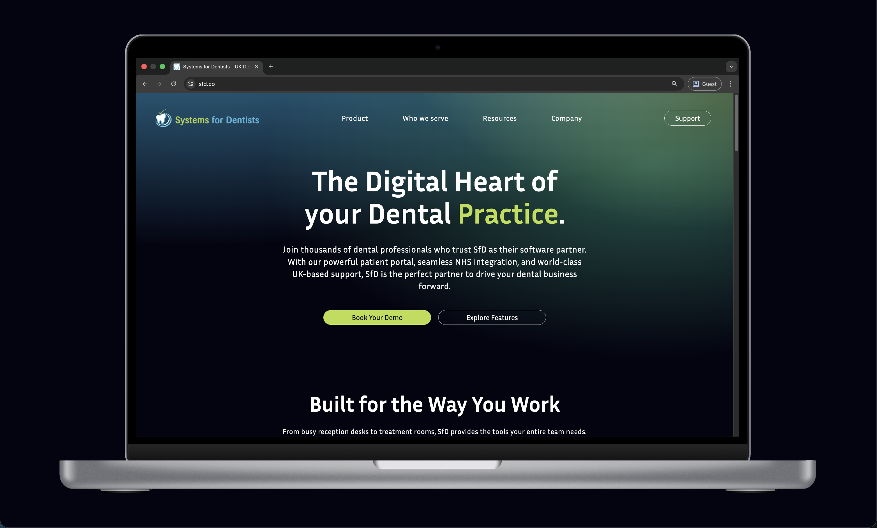
Ensuring to match the branding of the company it was a necessity to use the 3 colours from the logo: Cyan, Lime Green & White. From experimenting with these colours I decided on using a Dark Blue as the background colour, this was visually appealing and created a nice contrast.
To ensure the design was going in the right direction I had to gain some other perspectives. I shared my ideas with Adam & James (CGO & MD at SfD) and got some good feedback. Feedback included ideas about how we could improve SEO and engage users from a business perspective, this business focus helped steer future iterations.
With the most of the Figma mockups ready, I led the search for a developer within a £1,000 budget. After reviewing portfolios on Fiverr, we selected Niral for her strong alignment with our desired style.
After creating the core pages, I handed off the remaining design work to Niral. Through iterative feedback using Figma’s commenting tools, we refined the design before moving into development.
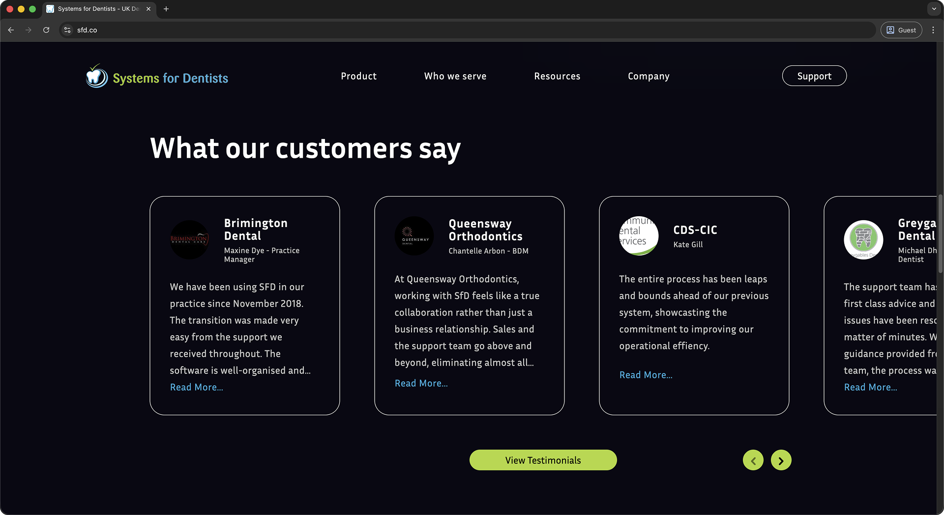
Having published the website we had what felt like never ending positive feedback. Users were elated that the experience became quick and reliable. Many also commented on how the background animation made the site feel alive.
After SEO optimisations and cross-browser testing, our site rose from 4th to 1st for “SfD” and now appears alongside top competitors for “Dental Software.”
Previously hesitant, the Sales & Support teams now proudly direct users to our site, which provides valuable resources for both end-users and internal operations.
The biggest constraint was time. Having to produce a new website in 2 weeks whilst working my normal job was quite difficult. So by the time we had finished I was proud but also critical of certain design decisions.
While the launch was successful, several UI refinements were identified; such as inconsistent text sizing, section spacing, and UI styling. For example the nav bar was quite distracting, the padding was quite large and the fact that it was sticky made it feel like it was taking up a lot of space on the screen.
During development, we explored different options for the navigation headings. One area that emerged was the label “Resources,” which didn’t communicate the content as clearly as a more direct term like “Help.” I had suggested alternative headings at the time, but as a team we aligned on the final direction. Looking back, and supported by customer feedback, clearer terminology would likely have improved usability, and it’s something I would approach with more emphasis in future discussions.
Moving forward, I plan to focus on implementing the UI refinements identified during the post-launch review. This includes addressing the text sizing and section spacing issues, as well as revisiting the navigation structure to ensure it provides a better user experience.
Additionally, there is an opportunity to improve content spacing across the site. The current layout is text-heavy, and introducing more visual elements would help break up content and enhance overall usability. Imagery was previously limited to avoid showcasing an outdated product; however, as the next iteration develops, more relevant visuals can be incorporated to create a more engaging and balanced experience.